Logo
The logo was designed on the basis of sensory units X and Y. The basis for X and Y is the FRITSCH lettering. The Y is derived from the vertical lines in the letters T and I. The X is derived from the horizontal lines of the lettering using the letter T as an example. These sensory units were then used to define the spacing. The result is a harmonious overall picture.
A second line was created for the DOUGH PROCESSING addition according to these rules.
Word mark
FRITSCH
FRITSCH
This lettering can be set in any font. It is not our figurative word mark, but merely our registered word mark. Please ensure that all letters of the word "FRITSCH" are capitalised in the body text.
Positioning
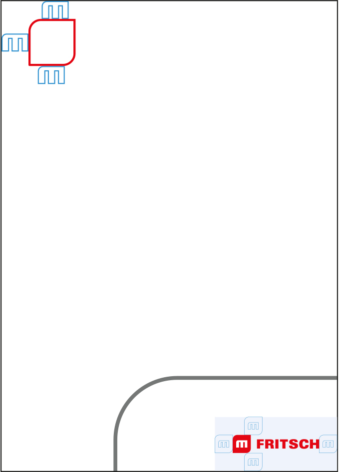
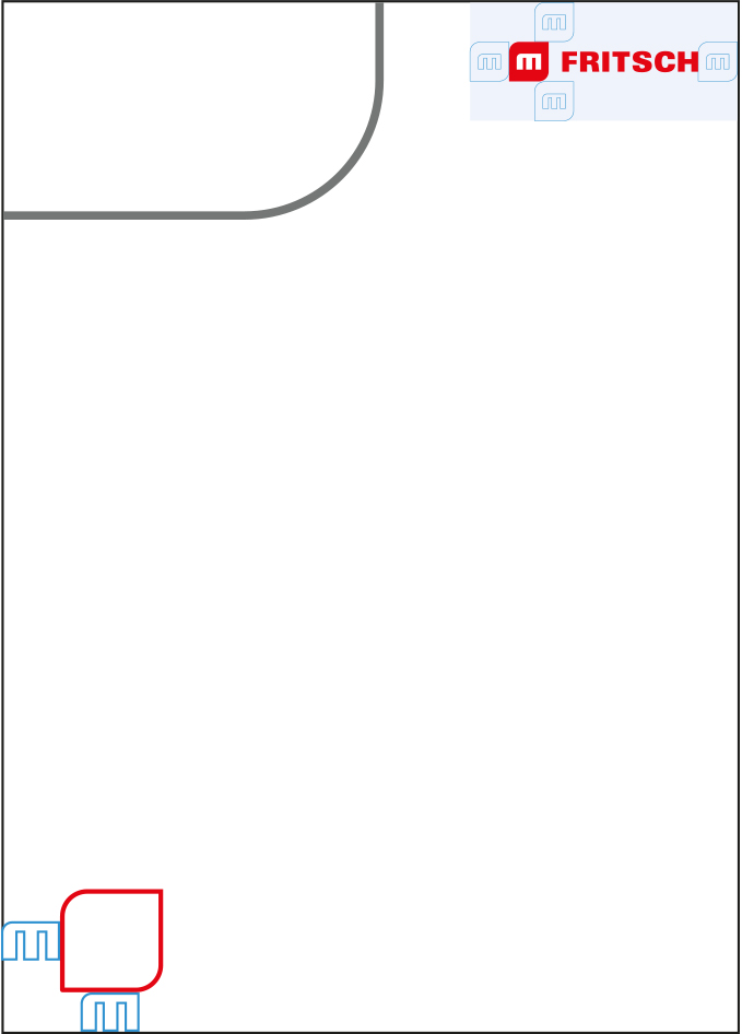
The word and figurative mark are placed together at the top or bottom.
The word and figurative mark are surrounded by a firmly defined protective space, which also serves for precise positioning.
The visual can be placed separately from the word mark, in compliance with the protective spaces for the visual and the rules for the visual in the bleed.
Print
Online
Protective surfaces
To ensure that the FRITSCH brand has sufficient distance from images, texts and other logos, a protection zone was defined around the logo.
There are two variants, whereby the first variant should always be given priority in the design. If there is a lack of space or format restrictions, the second variant can also be used. This results from the "M" lettering of the visual and offers a more space-saving placement option.
Logo data
The FRITSCH logo can be downloaded in the formats AI (Adobe Illustrator), EPS, JPG and PNG. The logo is available in 4c and as a special colour (Pantone).
If you need a different file format or a different requirement for the logo, please contact mc[at]multivac.de
Variants
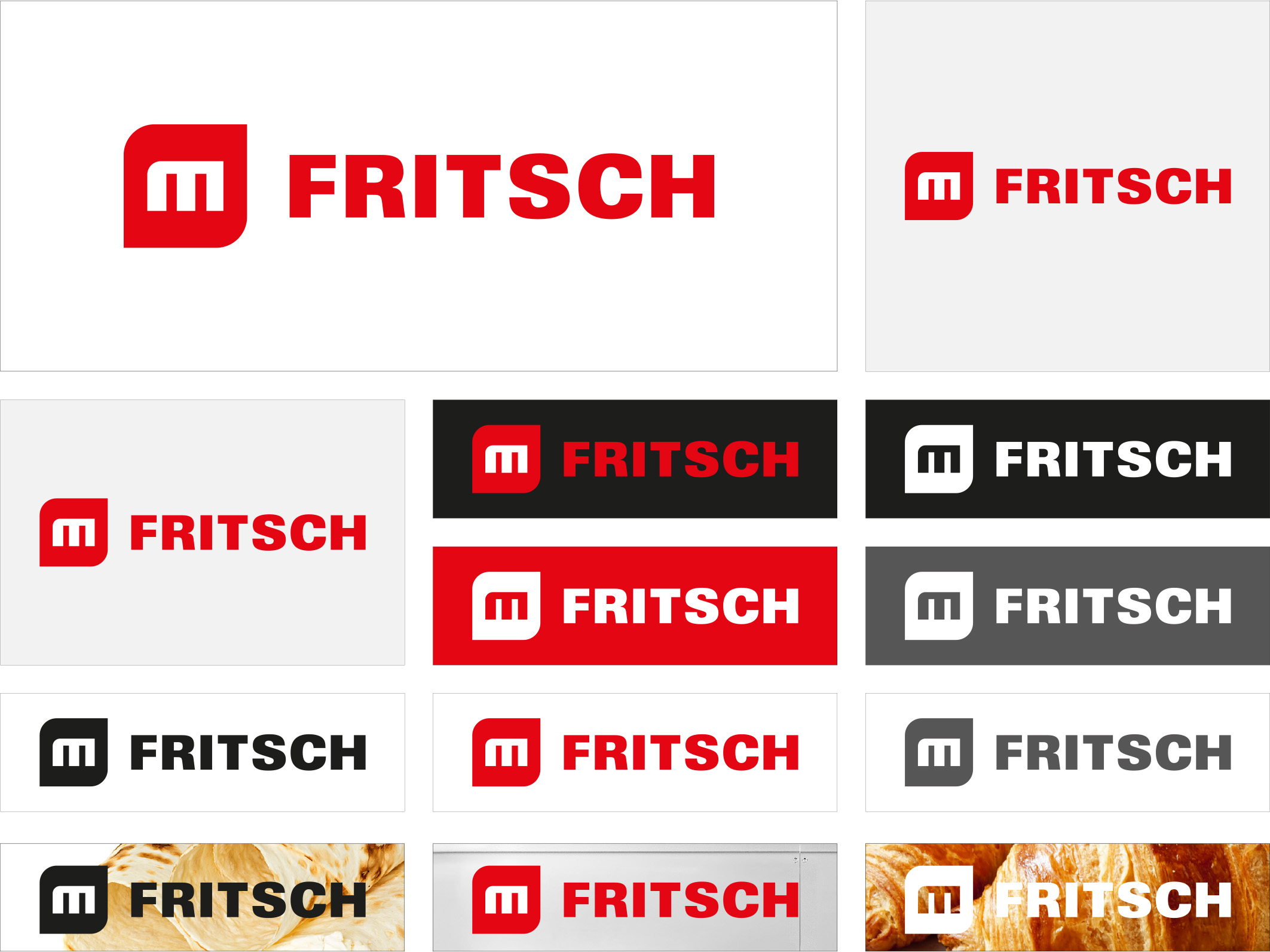
The FRITSCH logo is available in two versions, which differ in the addition of "Dough Processing" in the second line. There is also a pure FRITSCH logo without the addition of the second line.
Special case
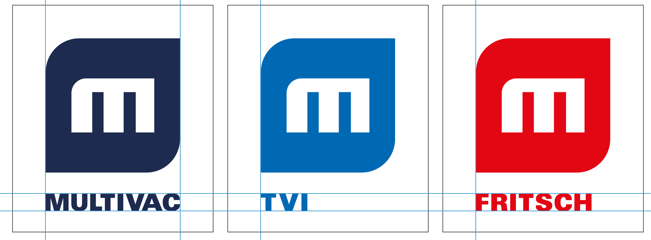
If several companies are displayed directly next to each other and the vertical version of the logo is used for visualisation, the following rule must be observed.
The company with the longest company name forms the basis for the font size and position of the company name. It is also important to ensure that the visual is displayed in the same size and position. The company name is aligned with the visual on the left.


