Brochures
Brochure concept
Our brochures are presented in a standardised and appealing design that reflects the MULTIVAC brand. The aim is to provide a clear and appealing overview of our products and topics. They are important communication tools for addressing our target groups in a targeted manner. Each brochure is carefully designed to be not only informative but also visually appealing. Special emphasis is placed on a consistent design that strengthens our brand identity and creates trust among our customers.
mock up brochure
Hierarchy
The brochure concept follows a clear hierarchy that allows design and content features to be recognised so that the hierarchy is also visible on the outside.
Brochure types
The types shown in the hierarchy are now broken down by content page
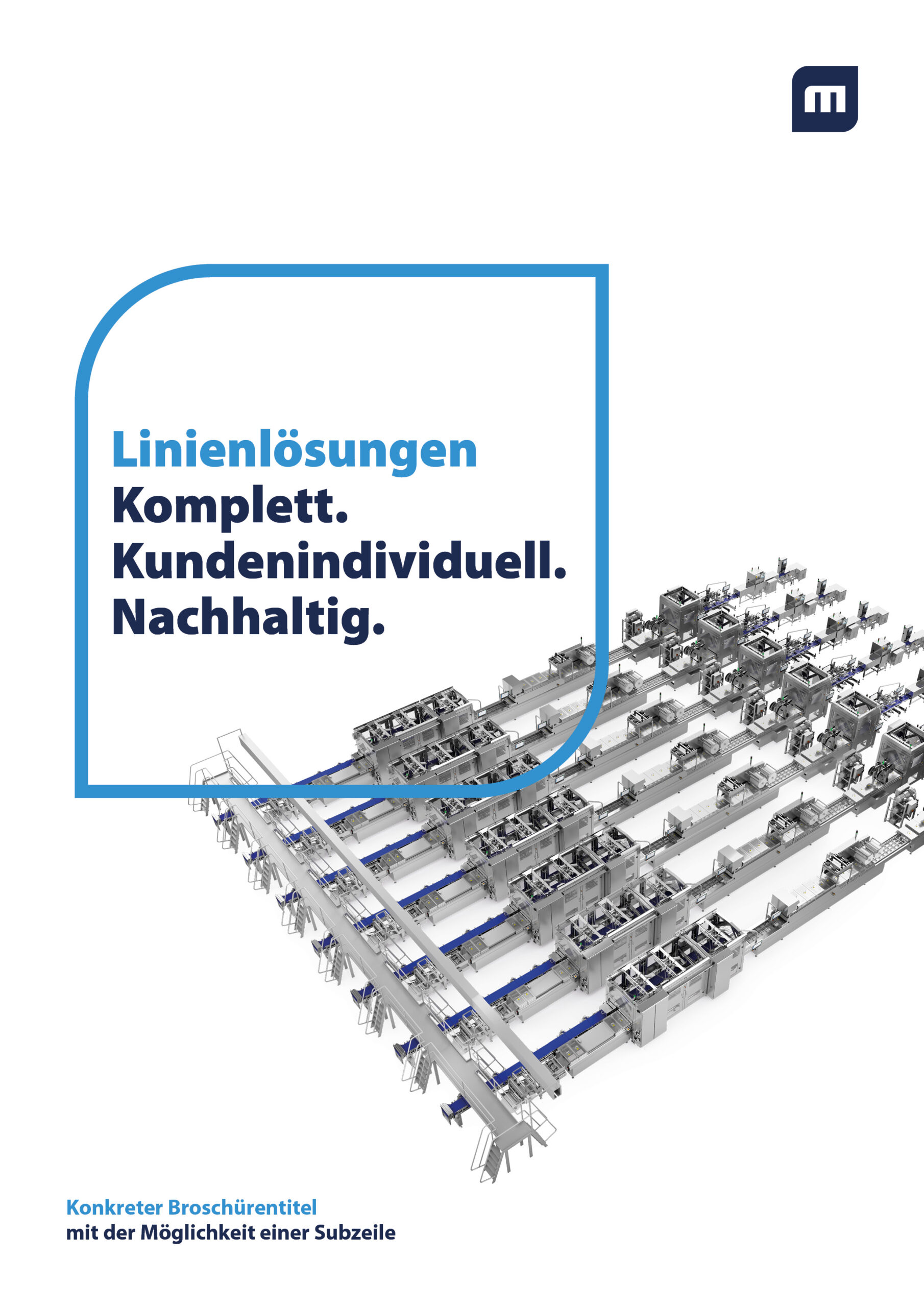
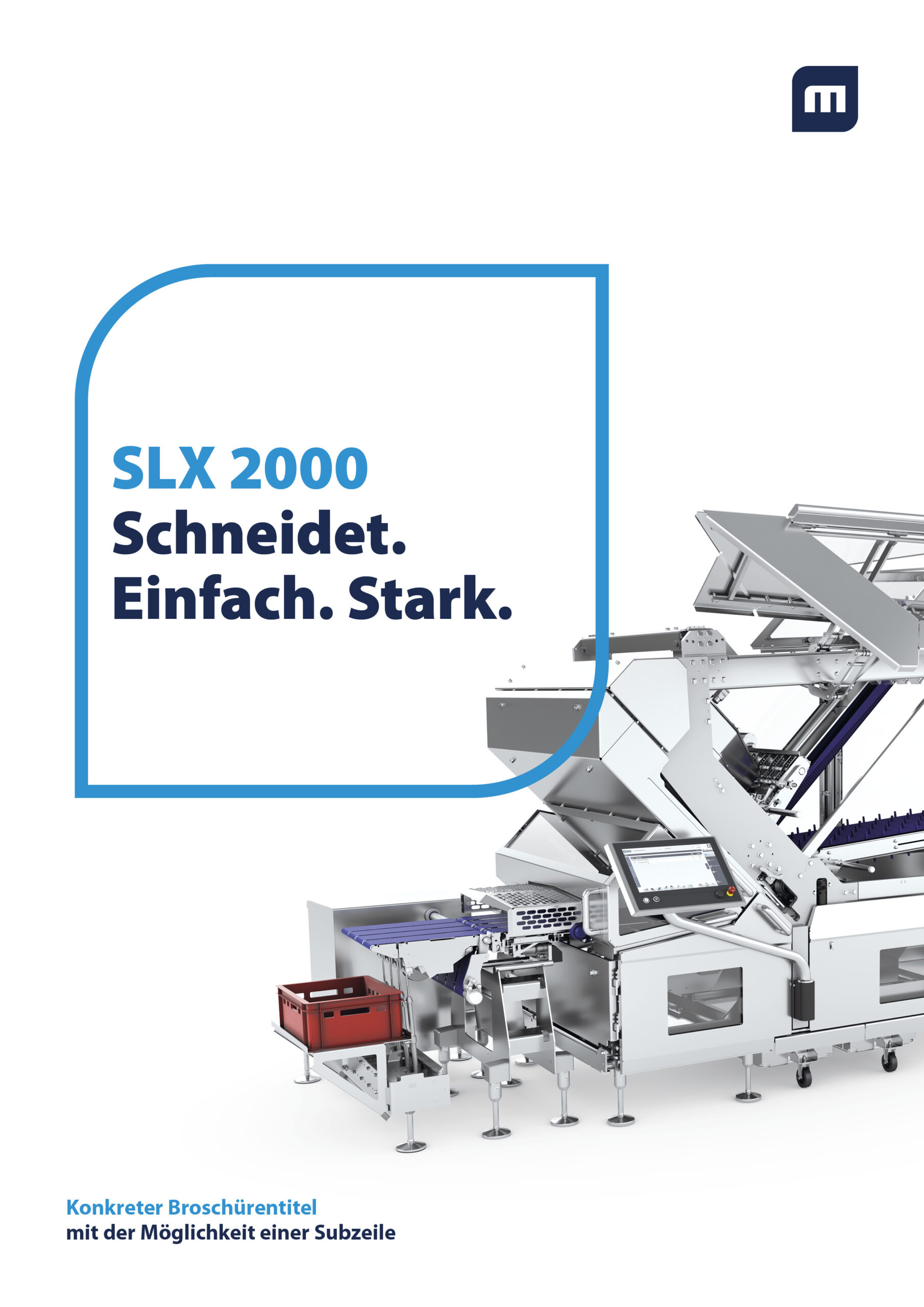
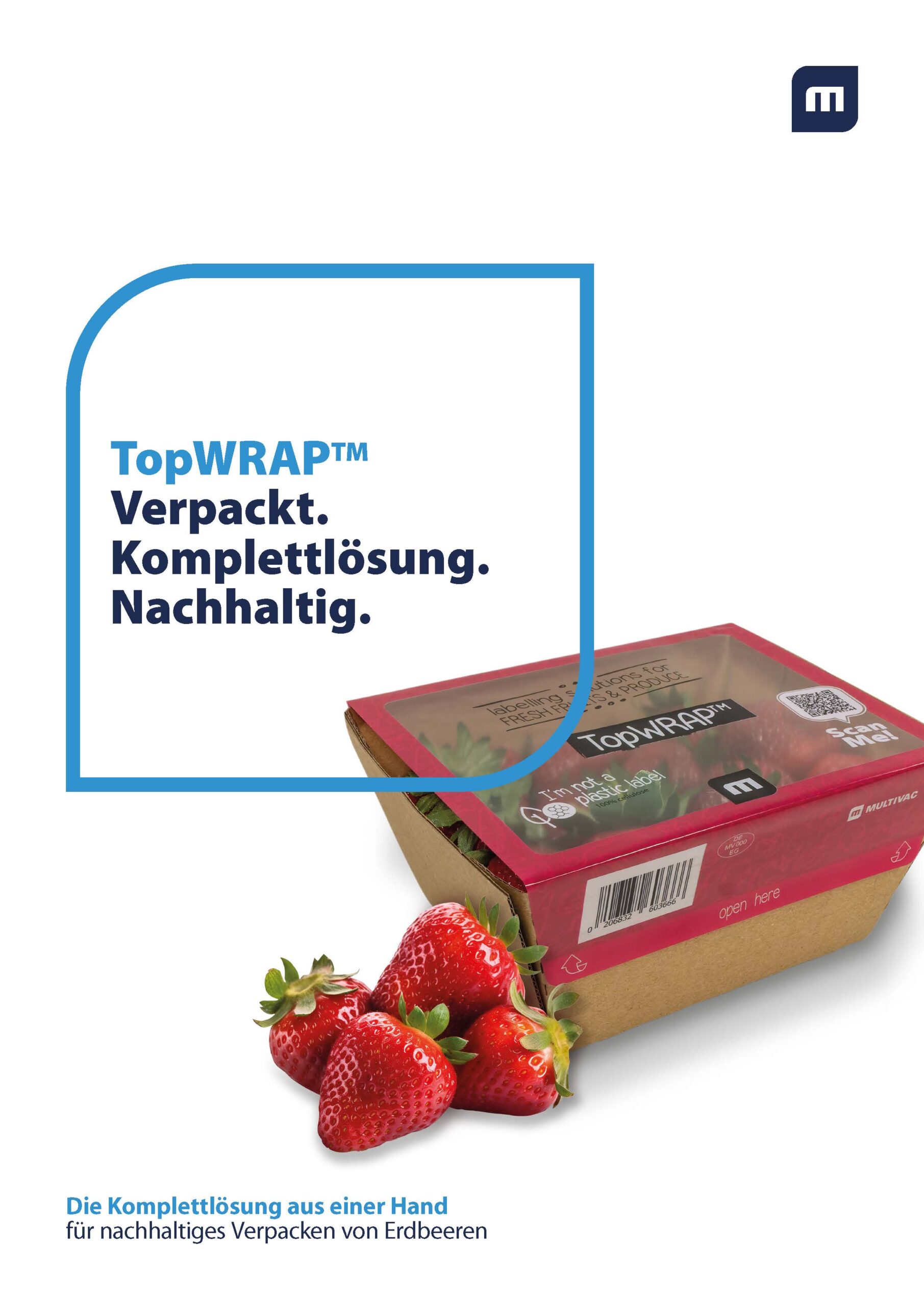
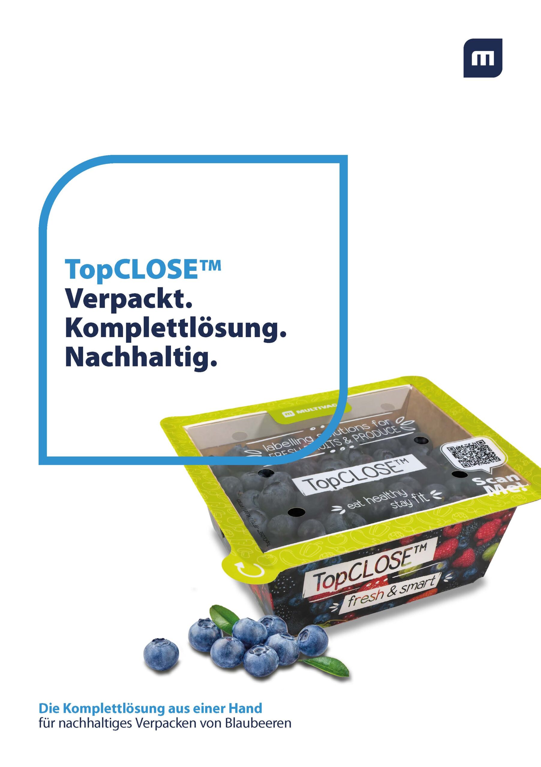
Front pages
Basic guidelines for front pages
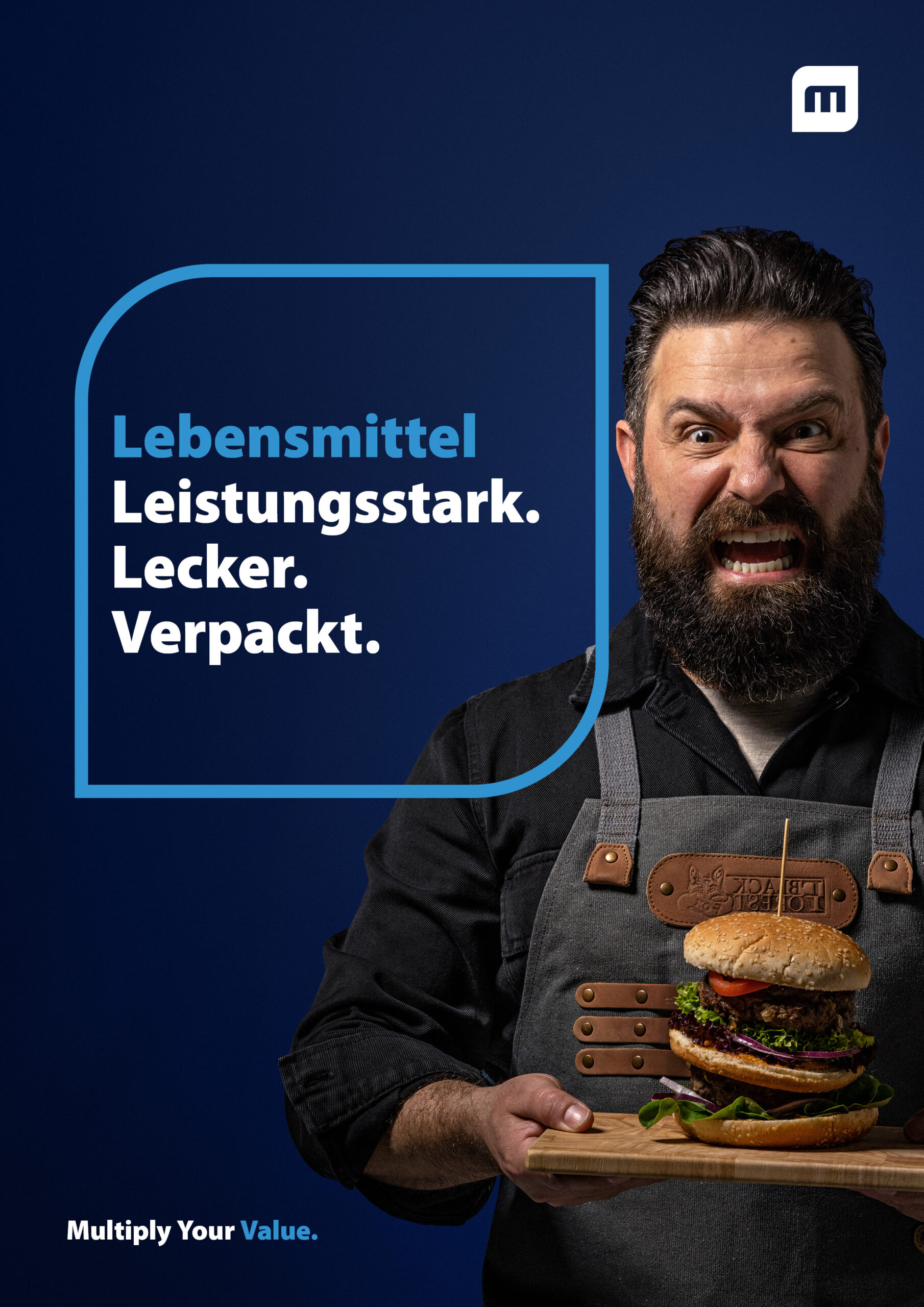
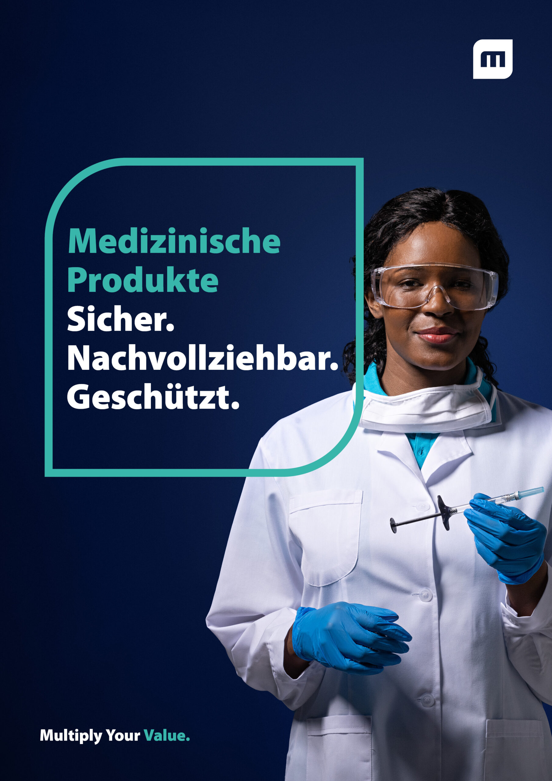
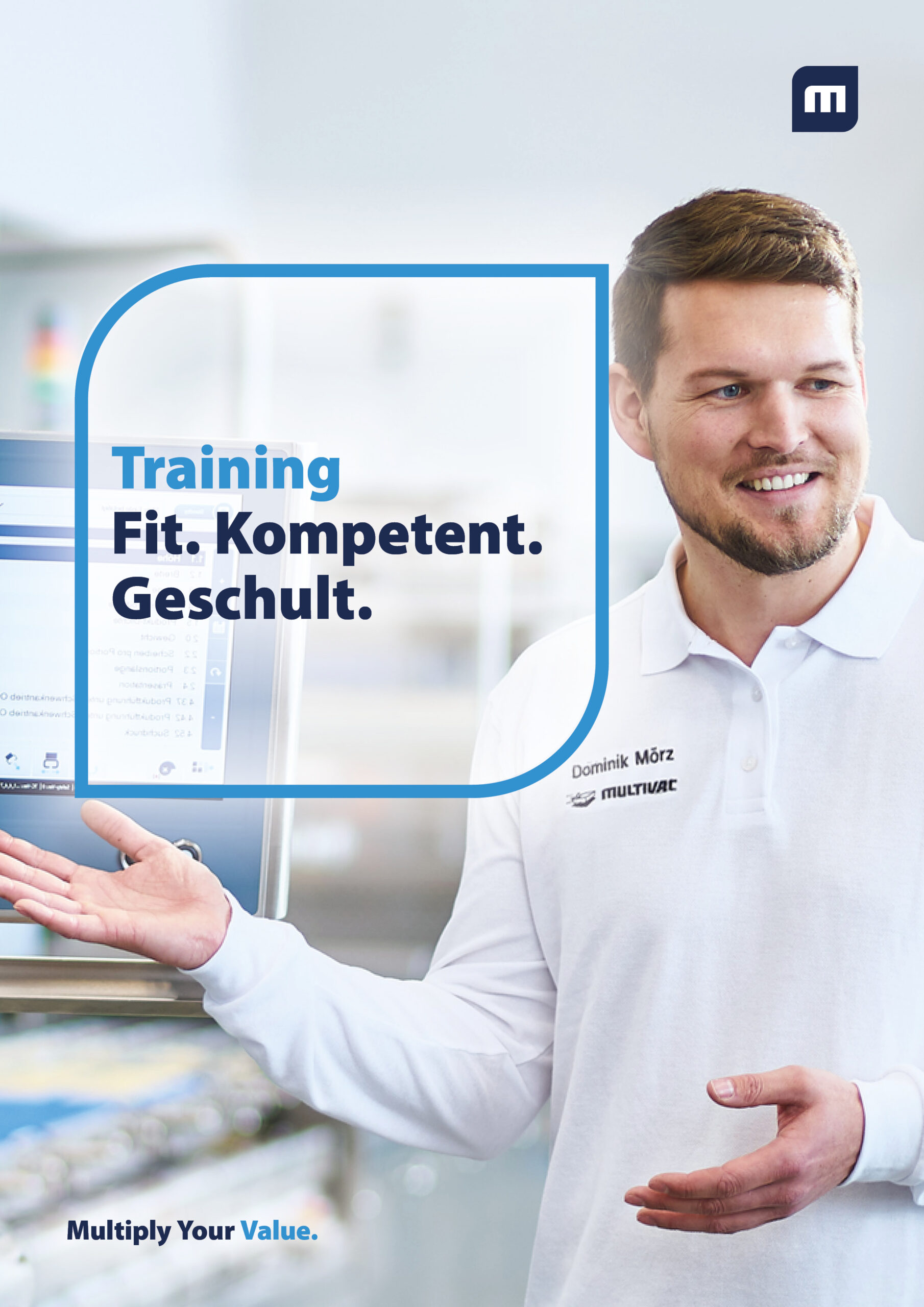
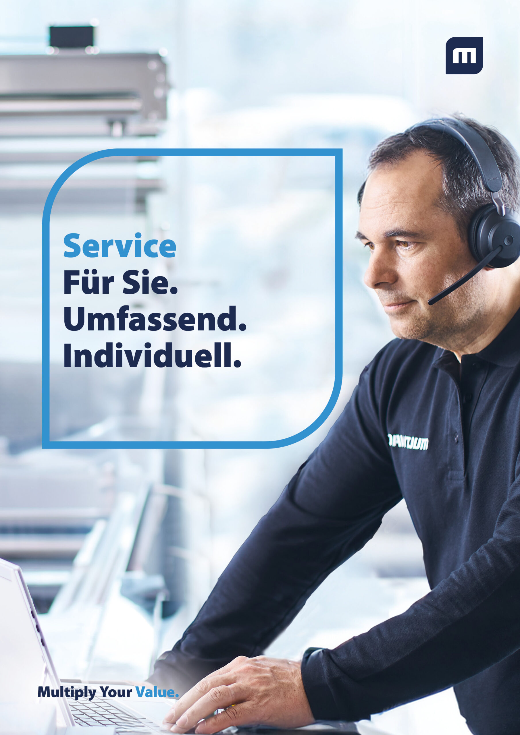
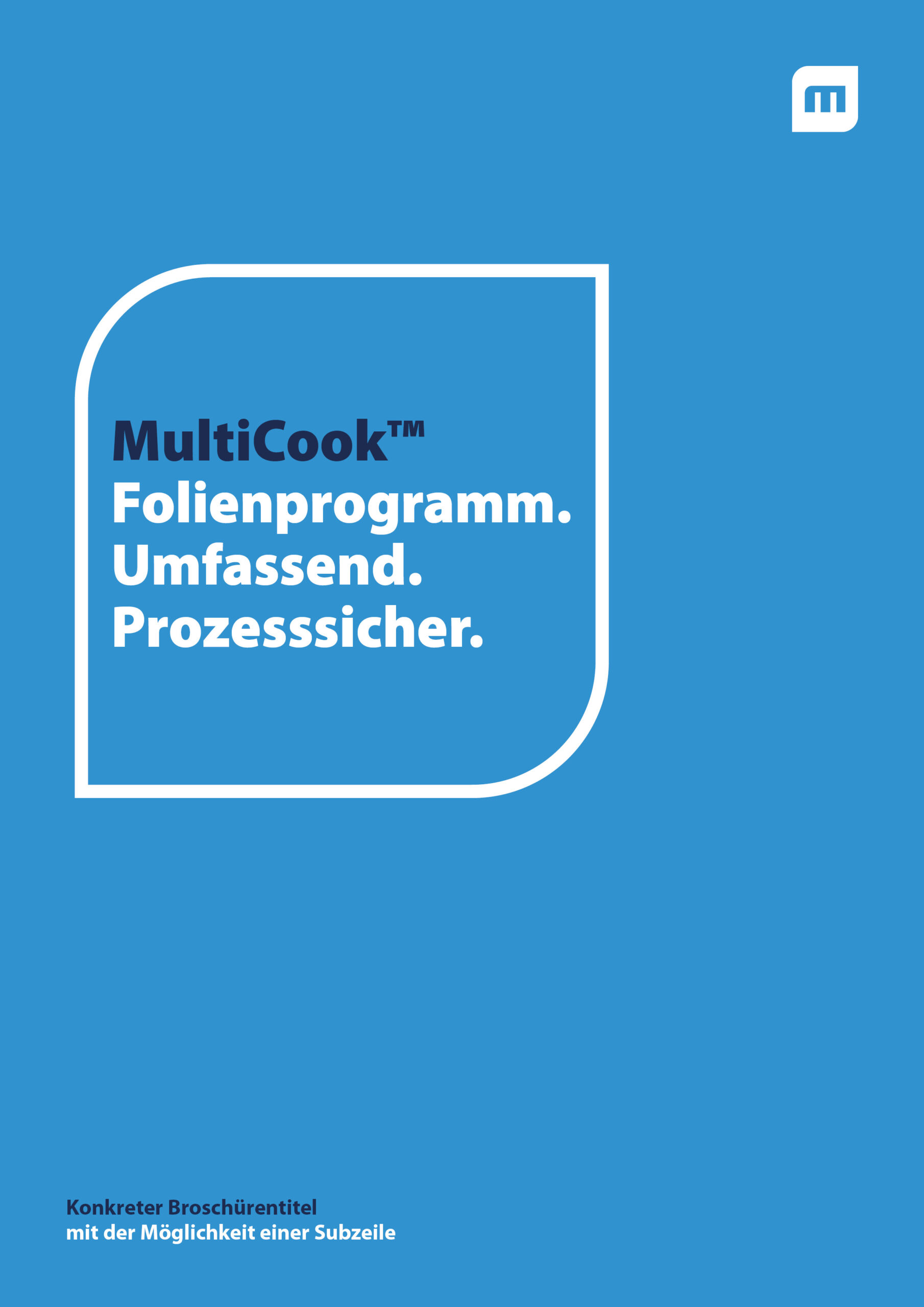
Basic cover page guidelines to be observed for any type of brochure include the following points: The content determines the size of the text in the frame, with a maximum font size of 40 pt. A reduction is possible in the case of unfavourable breaks. A bicolour look is used for a visually appealing presentation. The various text elements are designed alternating between CI light blue and dark blue. For example, the first line in the CI frame should always be in light blue and the following three keywords in dark blue, as well as the slogan "Multiply" in dark blue and "your value" in light blue.
Stage 1: Image brochure / sustainability report
Design
Contents
Stage 2: Application / industry brochure
Design
Contents
Stage 2: Brochures from the aftersales sector
Design
Contents
Stage 2: Product brochure
Design
Contents
Level 3: application profile
Design
Contents
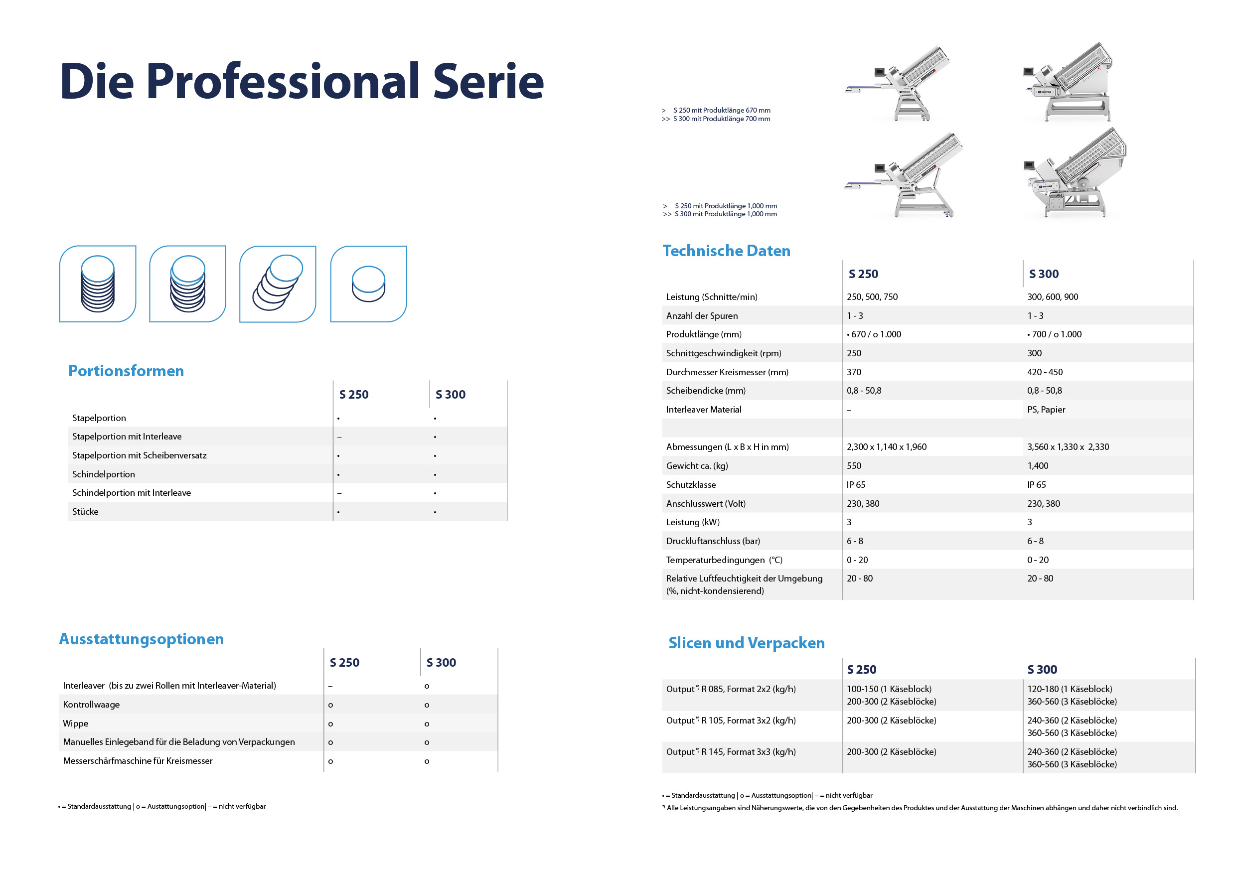
Stage 3: specification sheet (spec sheet)
Design
The front page has a light blue background and is presented in a single-colour design without an image or graphic. The frame in the CI design is in white. The exact topic is placed in the first line. This is followed by three characteristic words that define the term in more detail in the first line. The visual is positioned at the top right, while the actual brochure title is given at the bottom left.
Contents
The specification sheet provides a technical introduction to various topics, focussing on detailed technical aspects. Each machine or technology is considered and analysed comprehensively from a technical point of view.
Content pages
Basic guidelines for the content pages
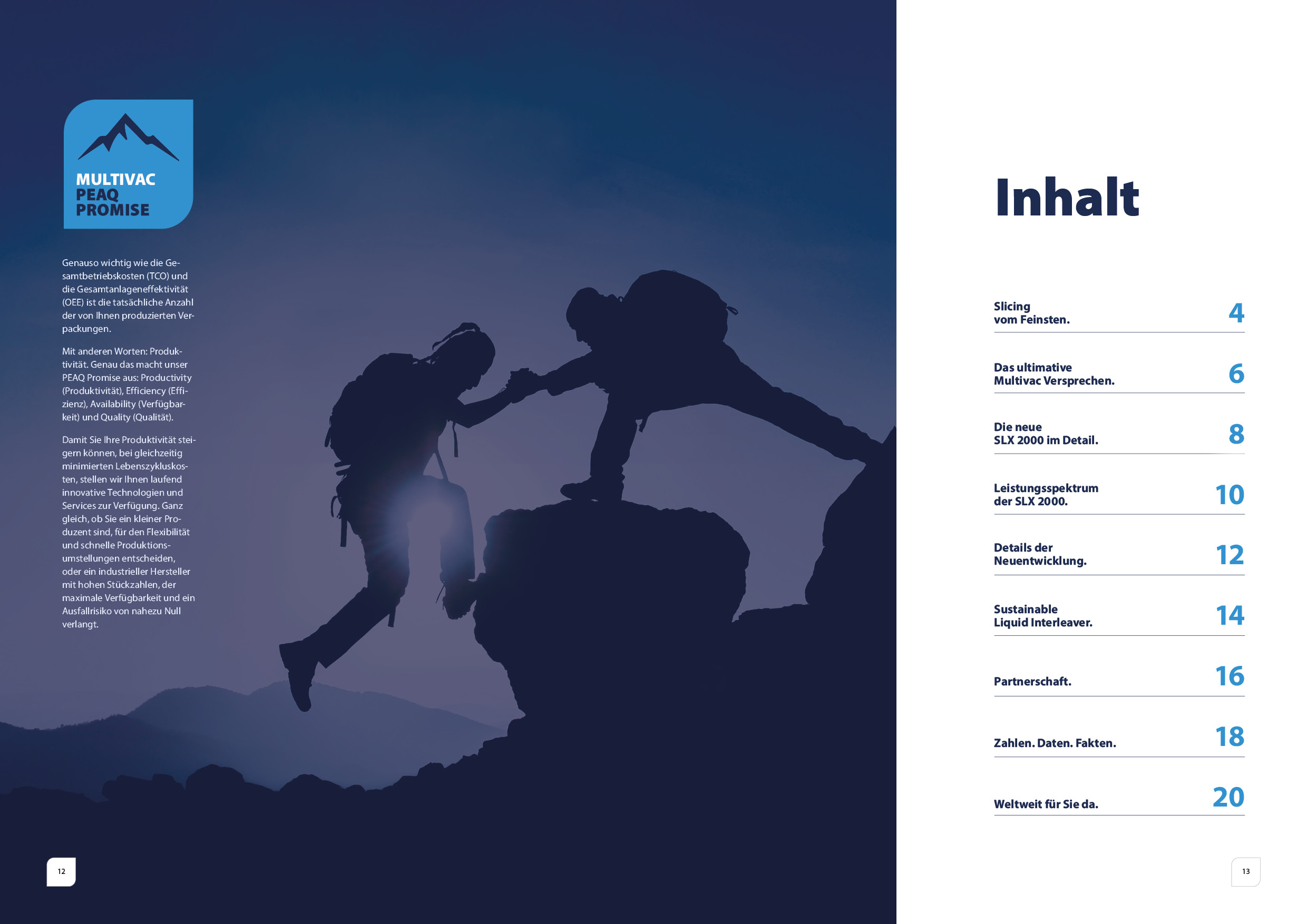
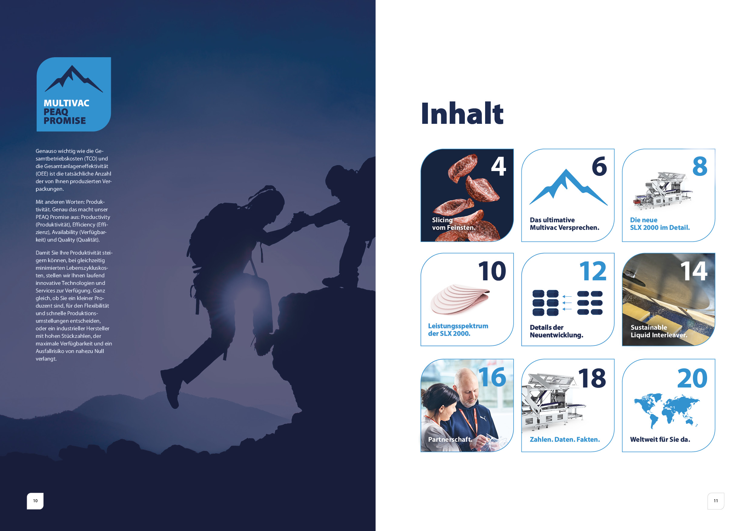
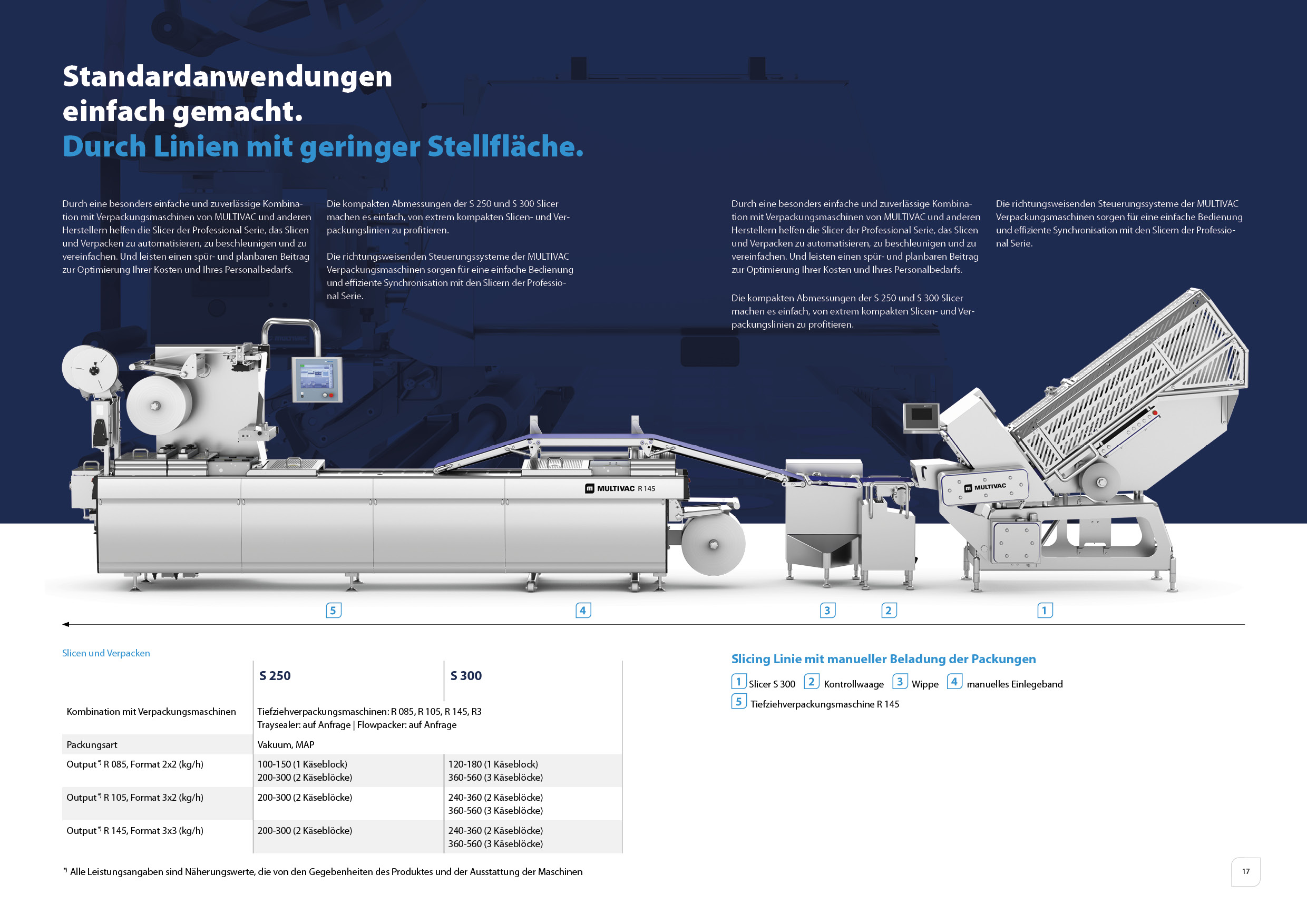
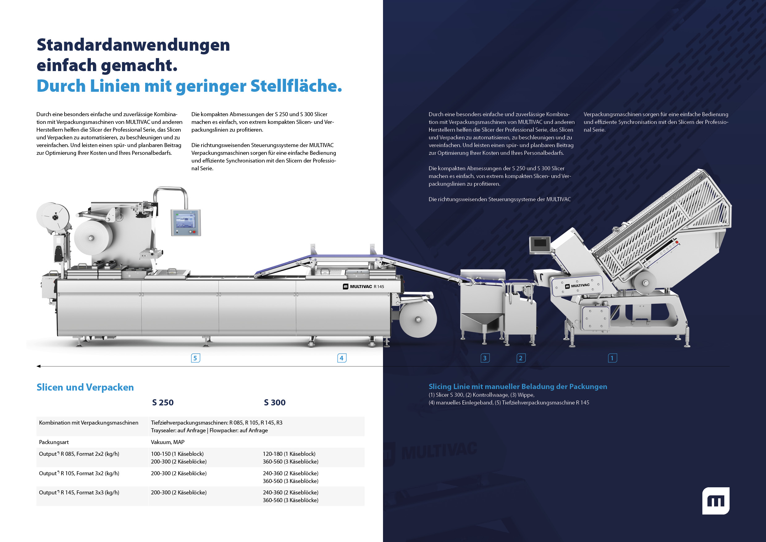
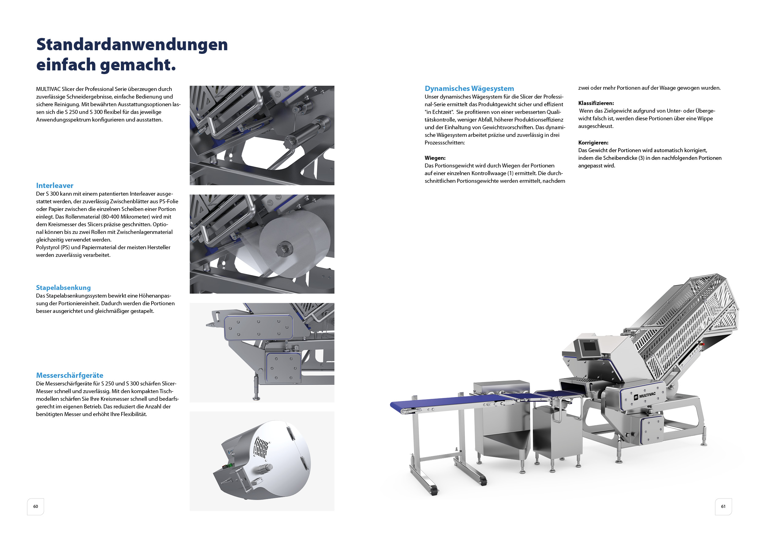
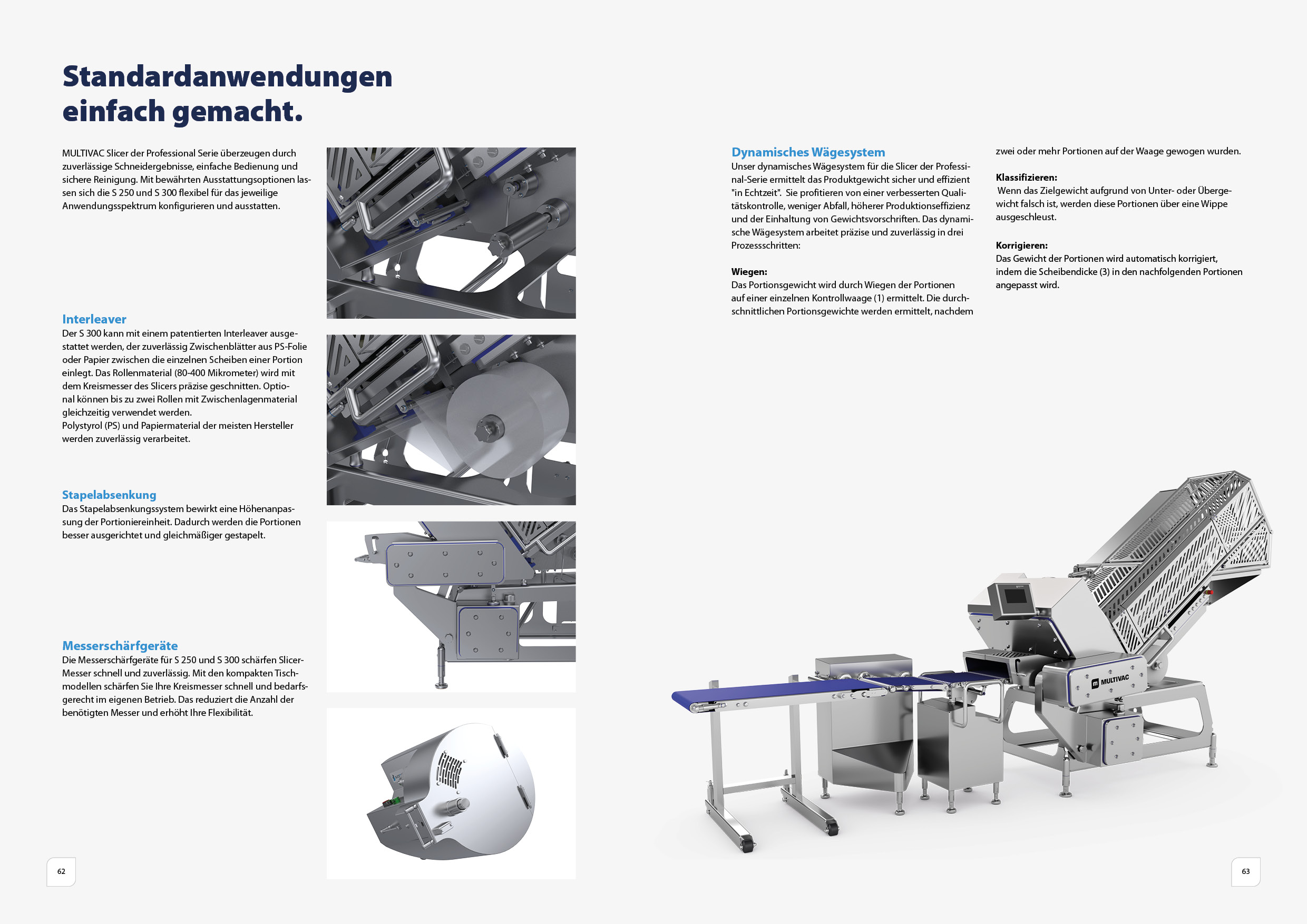
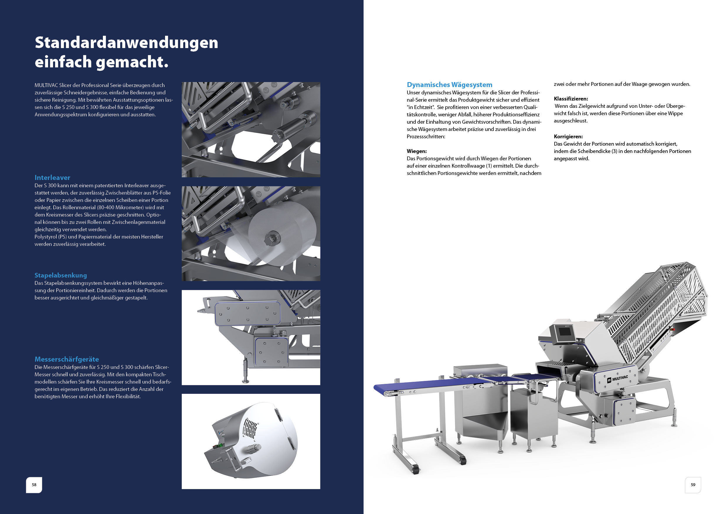
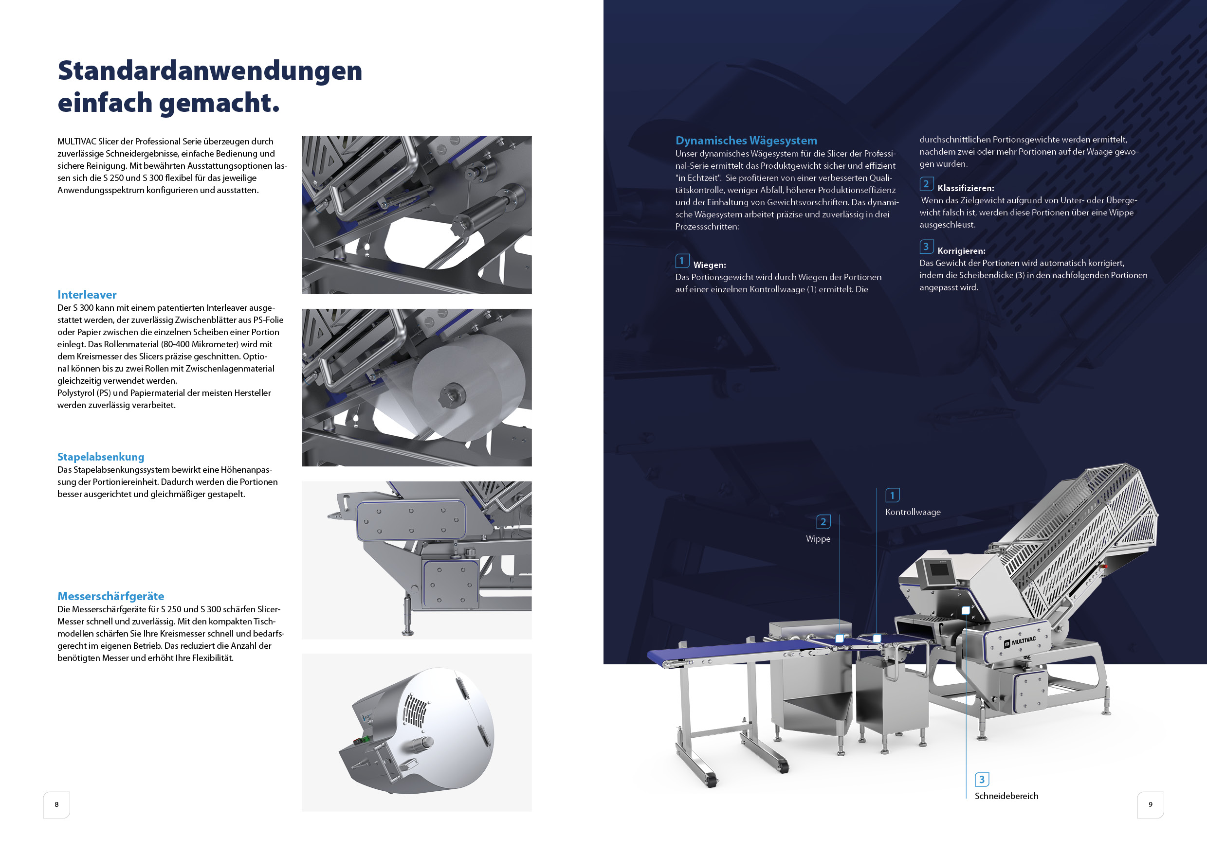
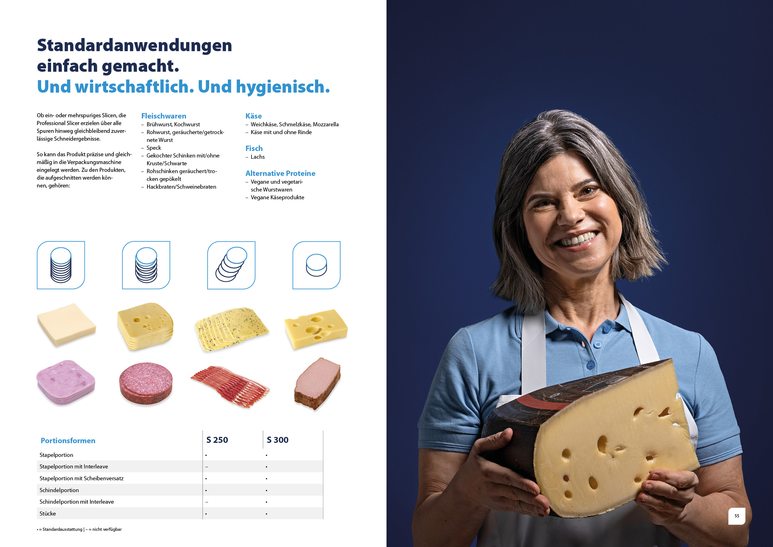
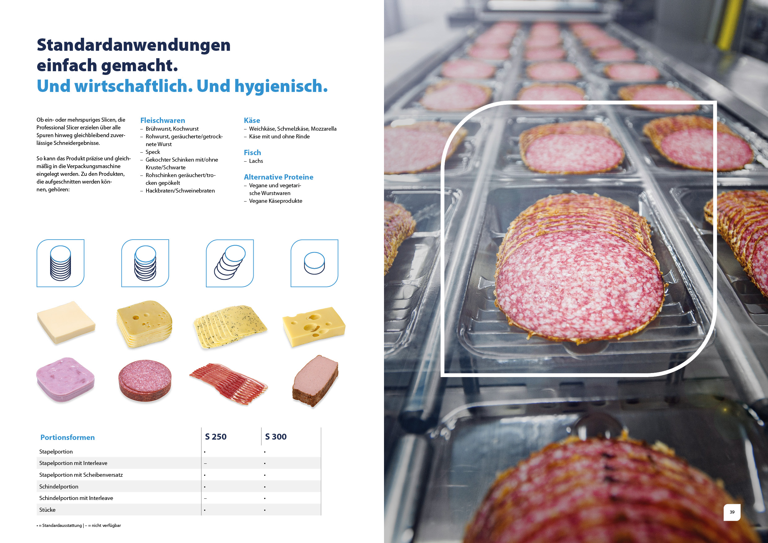
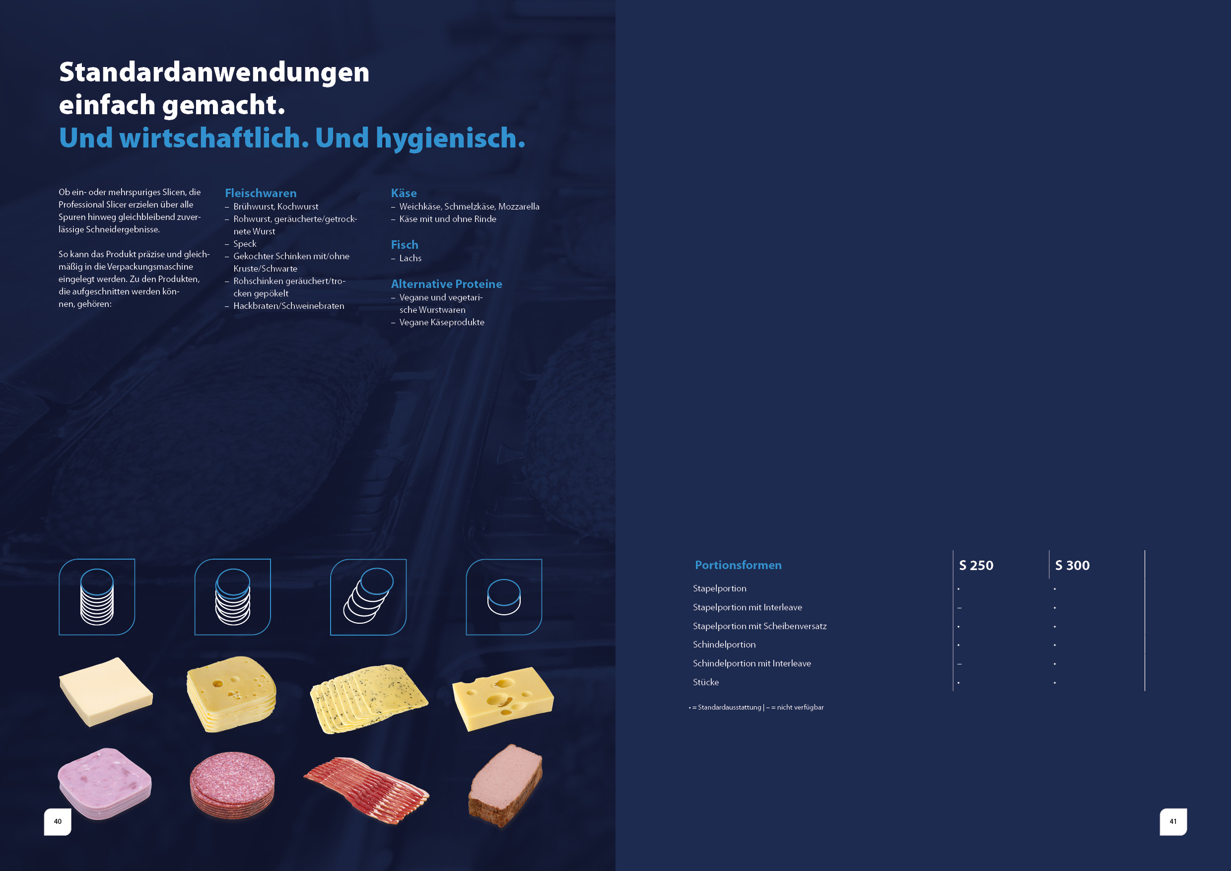
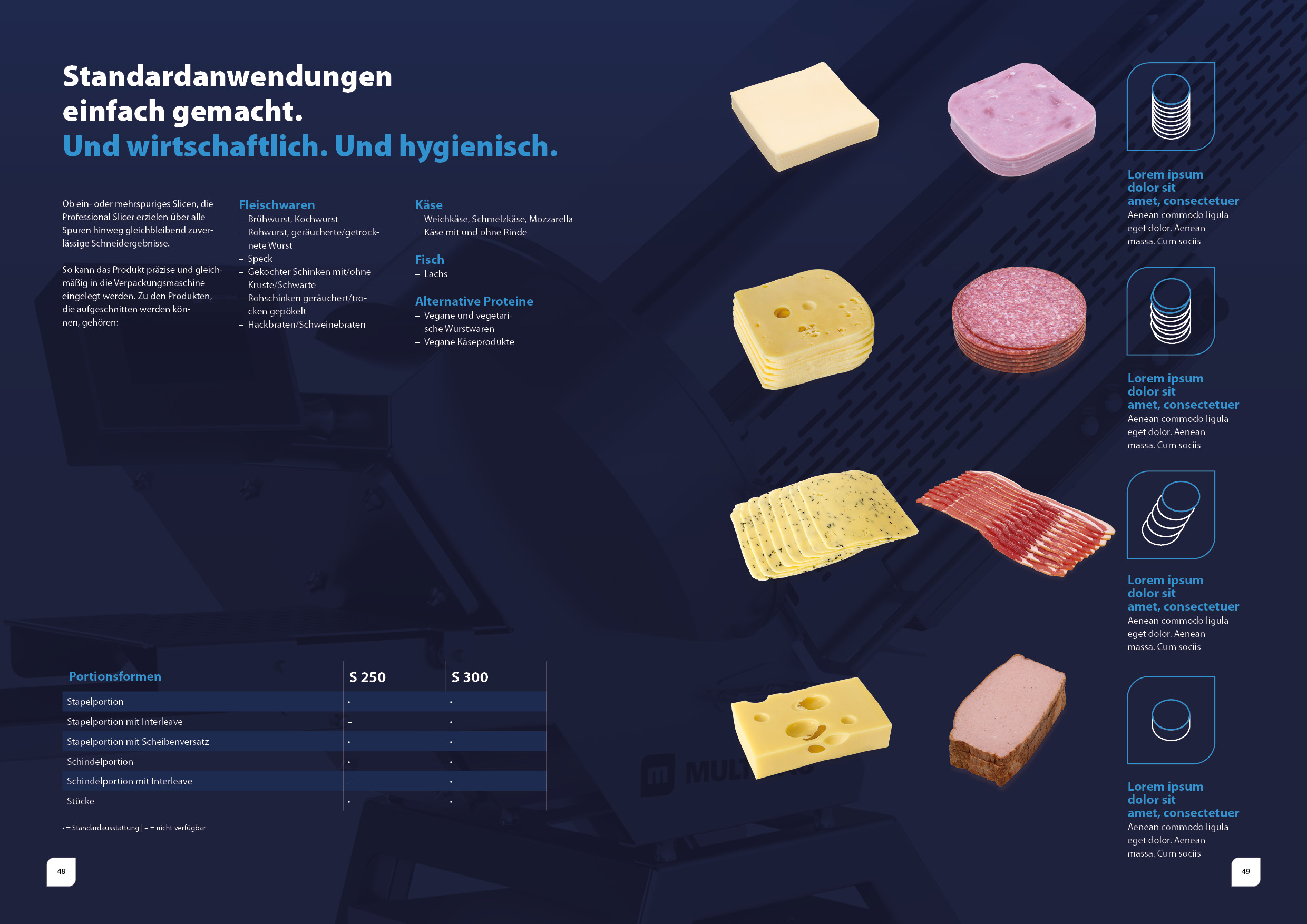
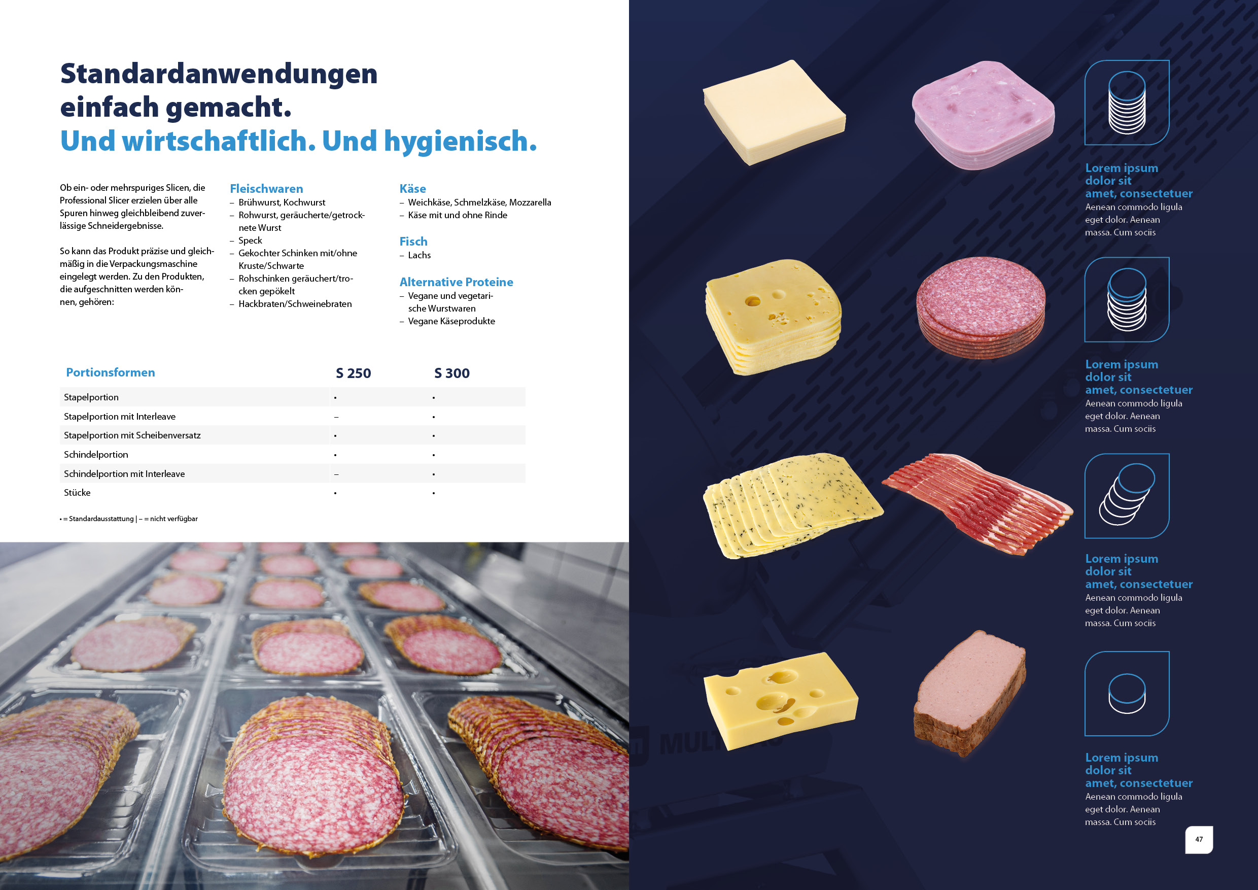
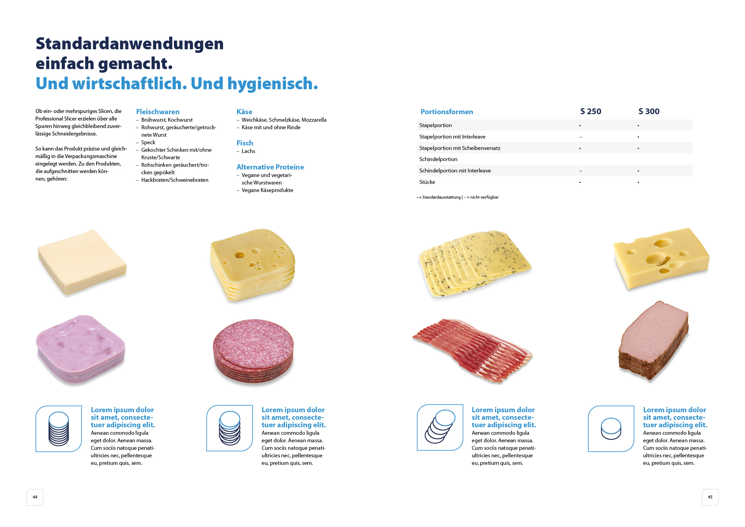
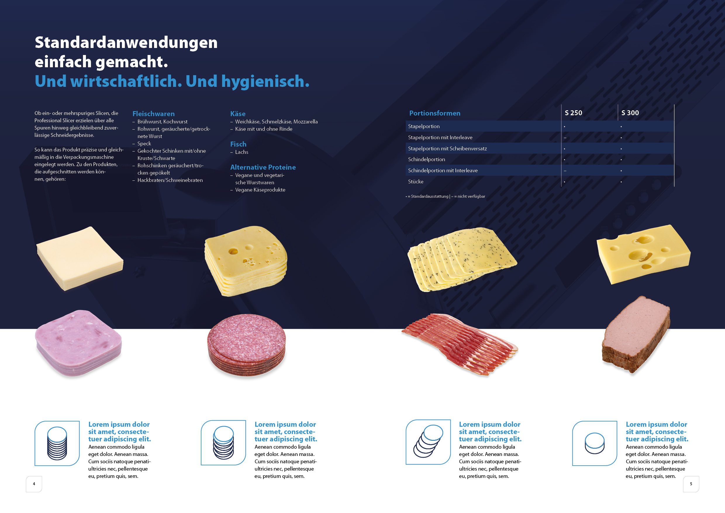
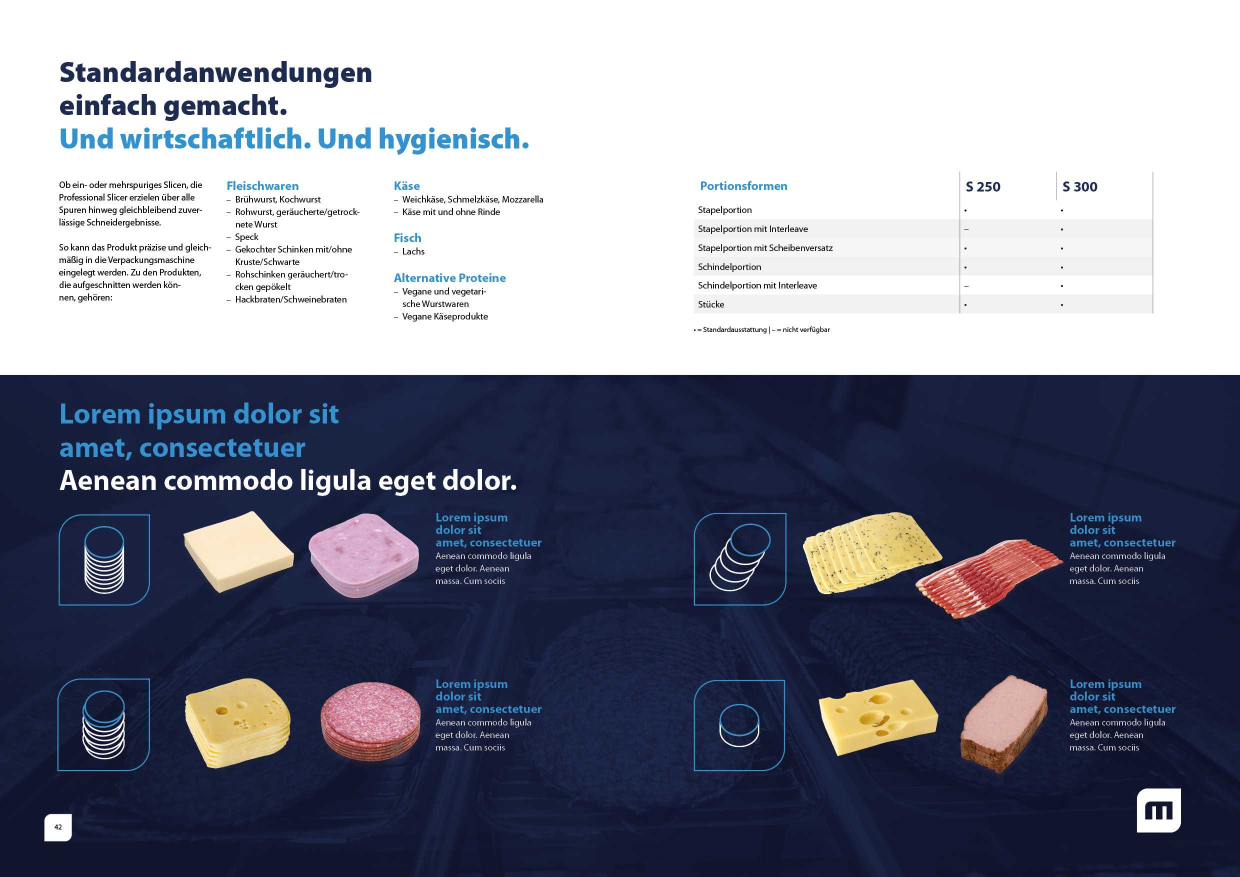
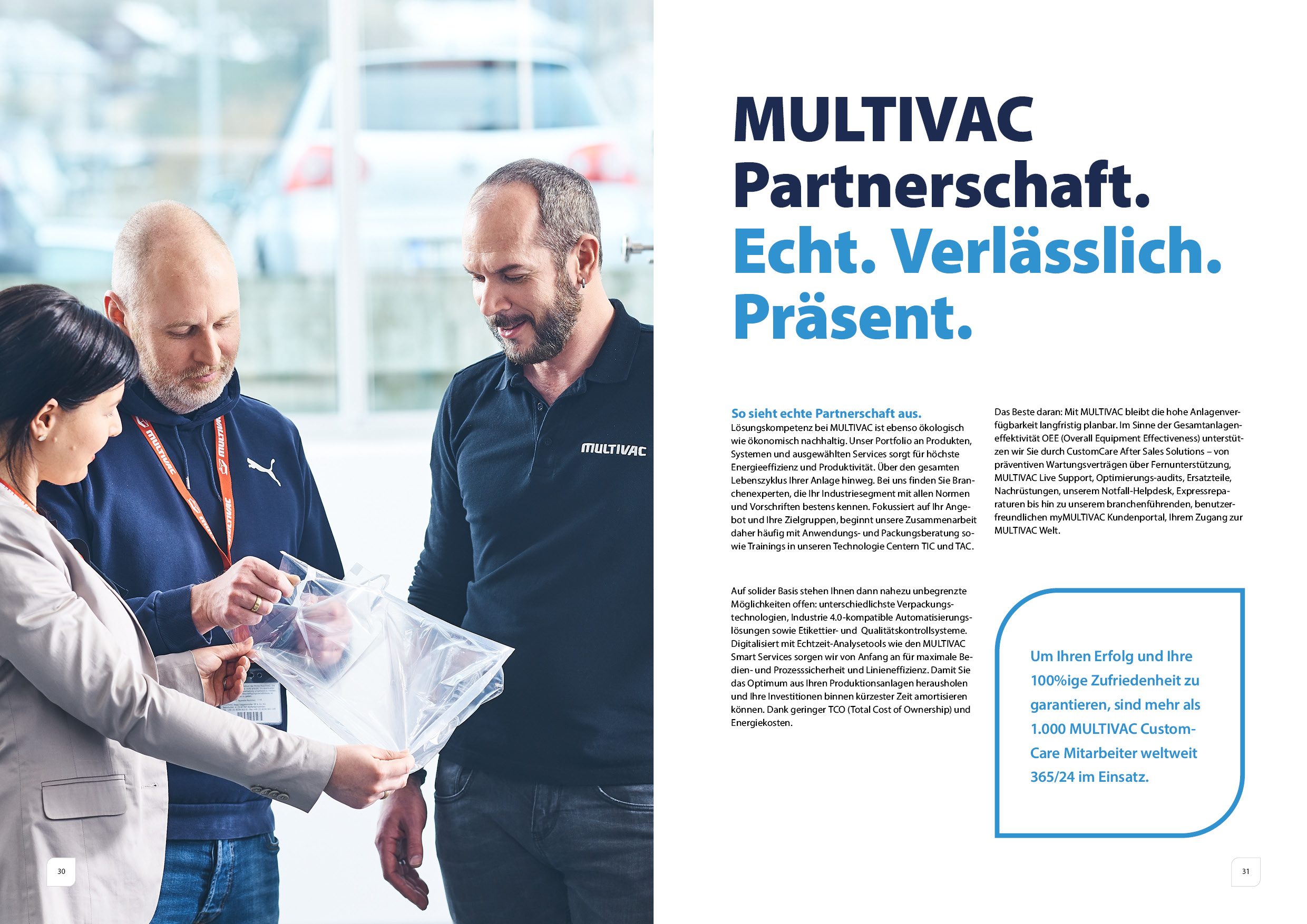
There are two variants for each content page: Variant A, which is preferred, and variant B, between which a choice can be made. The decision for one of the variants should be based on the colour weighting. It is essential to consider the brochure as a whole and to take the overall position into account. A detailed explanation of colour weighting can be found under Basic elements\Colours\Colour weighting in the CI portal. (insert link/path) If, for example, predominantly dark blue elements have been selected so far, it is advisable to choose the lighter version for the next page. This ensures that the colour weighting of the brochure has a white content of approx. 50% to convey a bright and friendly overall impression.
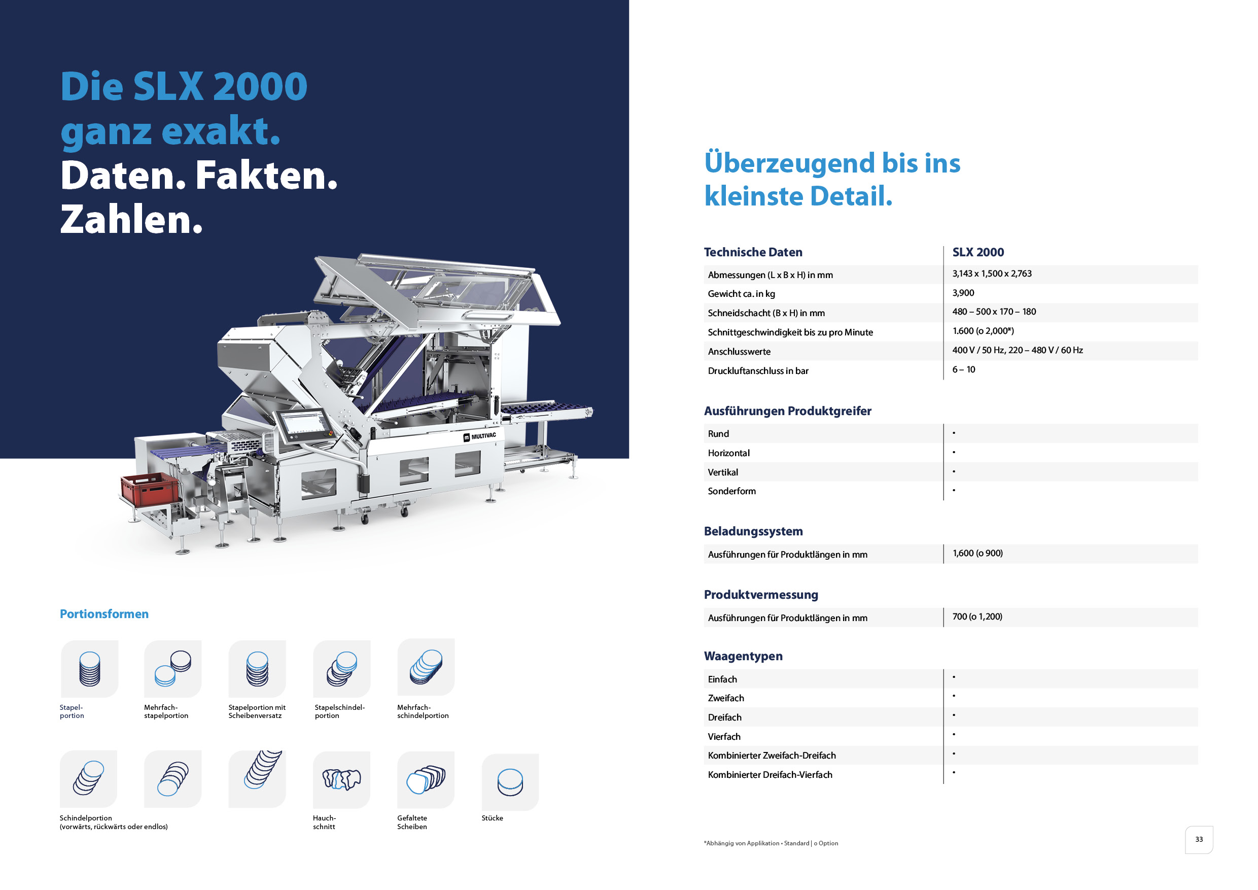
Page numbers must always be used on the content pages. These must be positioned within the CI frame, which is filled in white and has a grey border. Care must be taken to ensure that the page numbers can be harmoniously integrated into the overall layout. If the available space on a page is not sufficient, the page numbers can be omitted.
Table of contents & PEAQ Promise
Version 1
The first version is characterised by a reduced form of presentation in which the table of contents provides a clear and structured overview. This enables a more precise categorisation of the individual elements. In addition, the PEAQ Promise is given more space within the presentation.
For industry, service & products
Version 2
Version 2 is a more detailed version, which offers a first insight through illustrations. This makes the PEAQ Promise smaller.
For image brochure, sustainability report
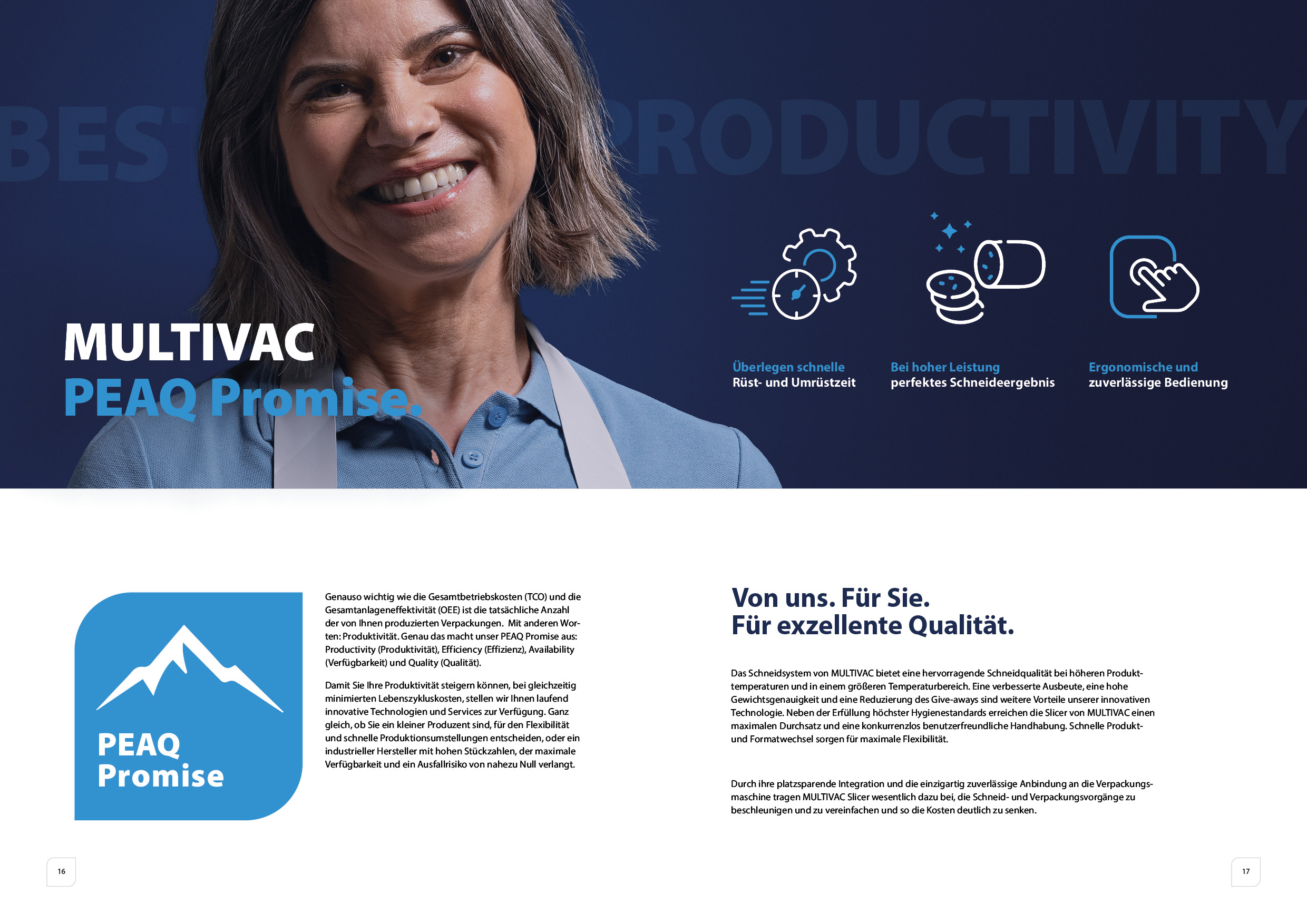
In machine and product brochures, a separate page is dedicated to the PEAQ Promise. The individual components are explained in detail on this page. For example, the 'efficiency' aspect of the new machine is emphasised through faster set-up and changeover times.
Entry page
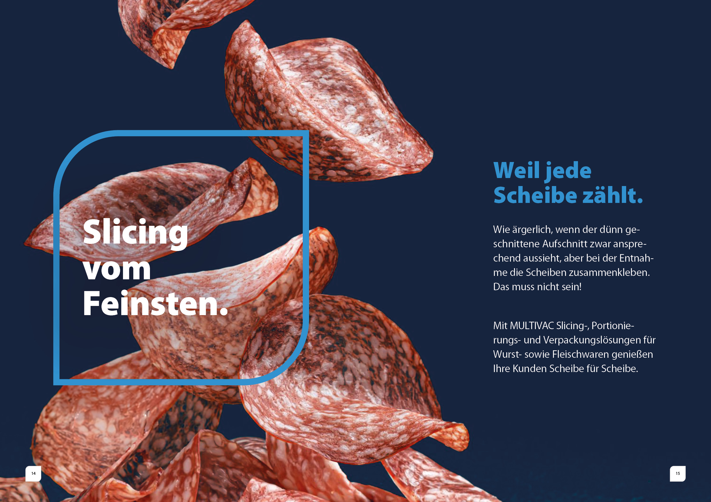
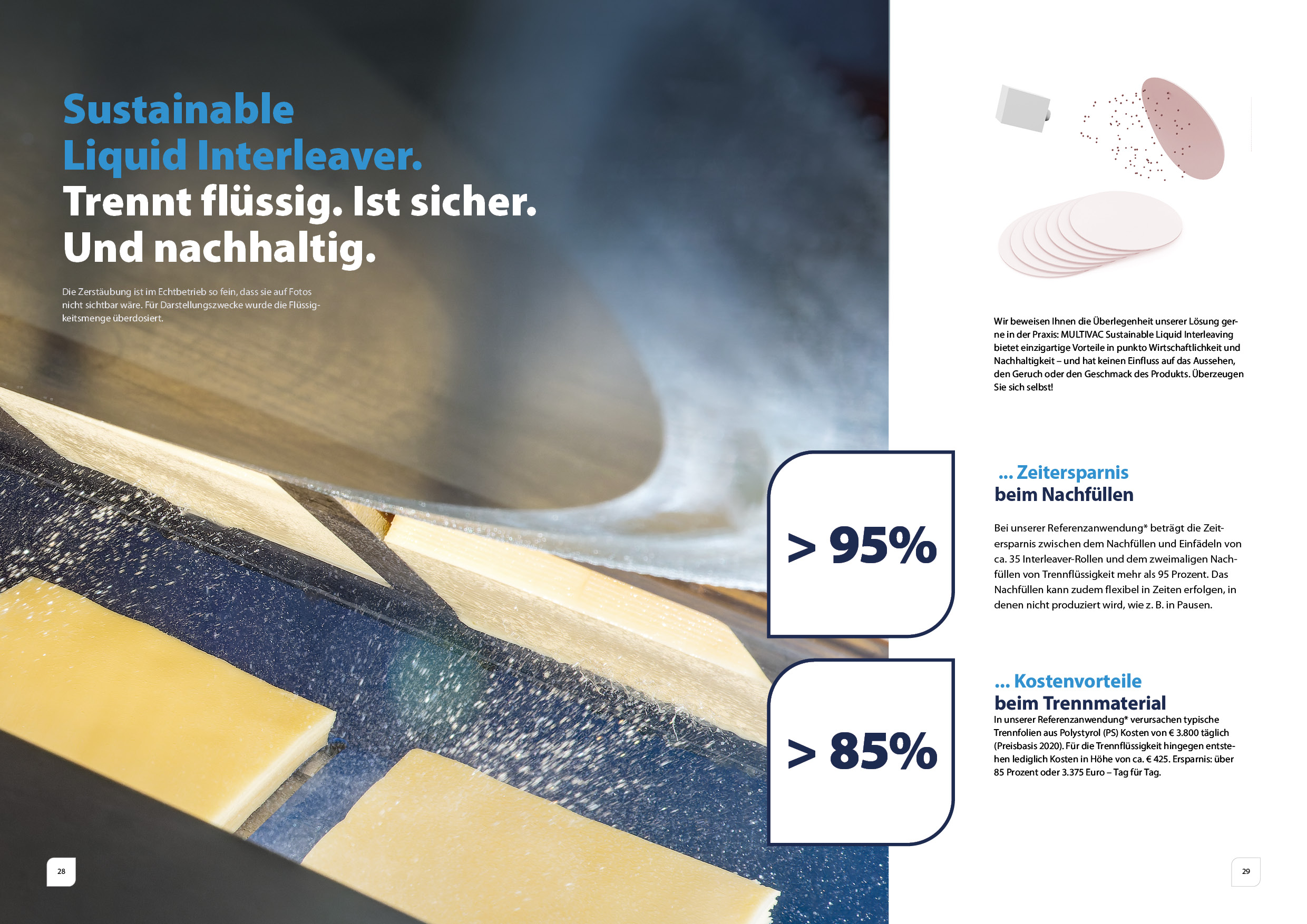
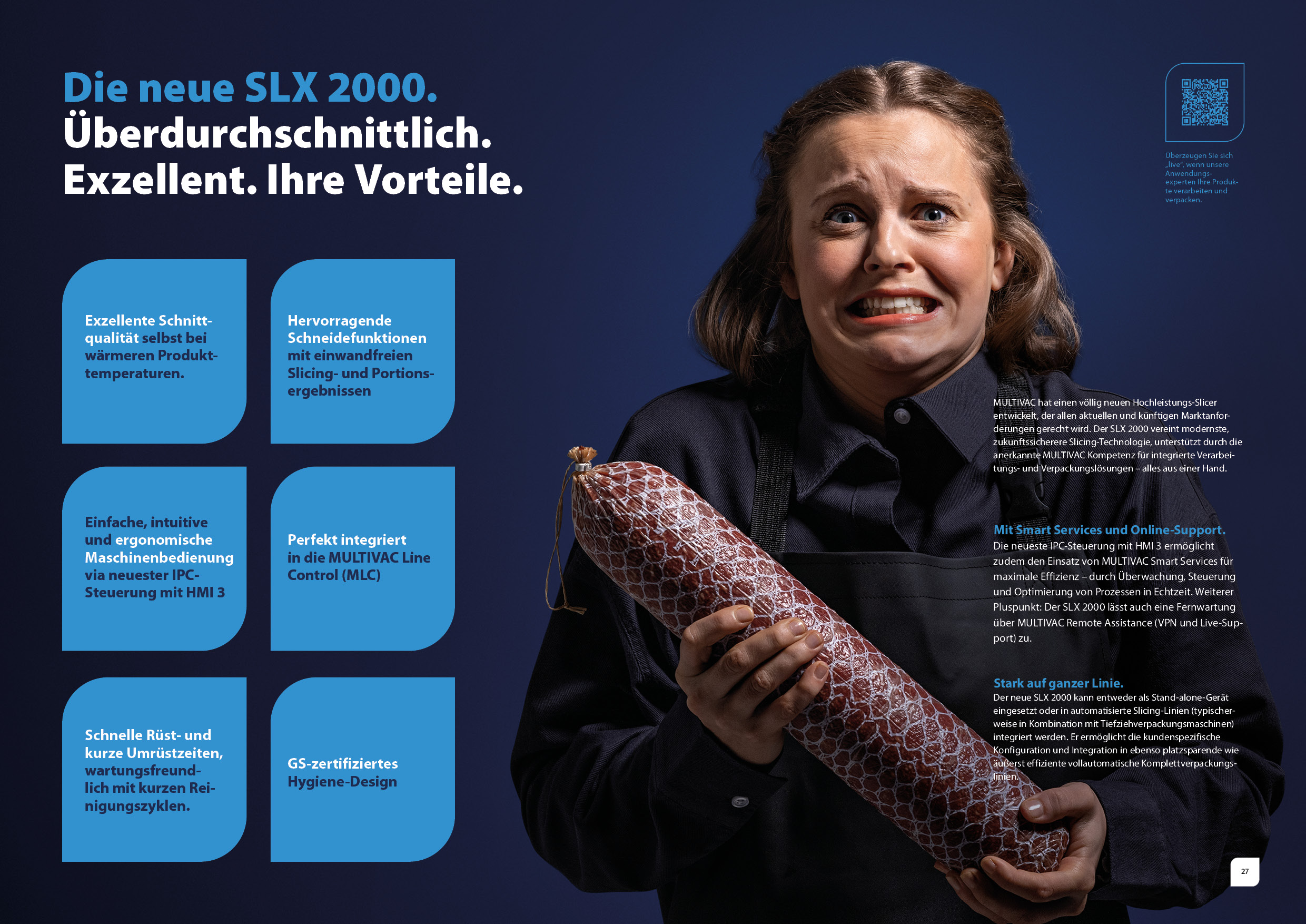
The introductory page of the brochure features a full-format background showing a motif that emphasises the topic, ideally a product image. A light blue CI frame contains the headline, which succinctly introduces the topic. This is followed by a subheading with an introductory sentence that explains the topic in more detail. For industry brochures, the hero is also used, combined with industry-specific sales arguments.
Product detail page
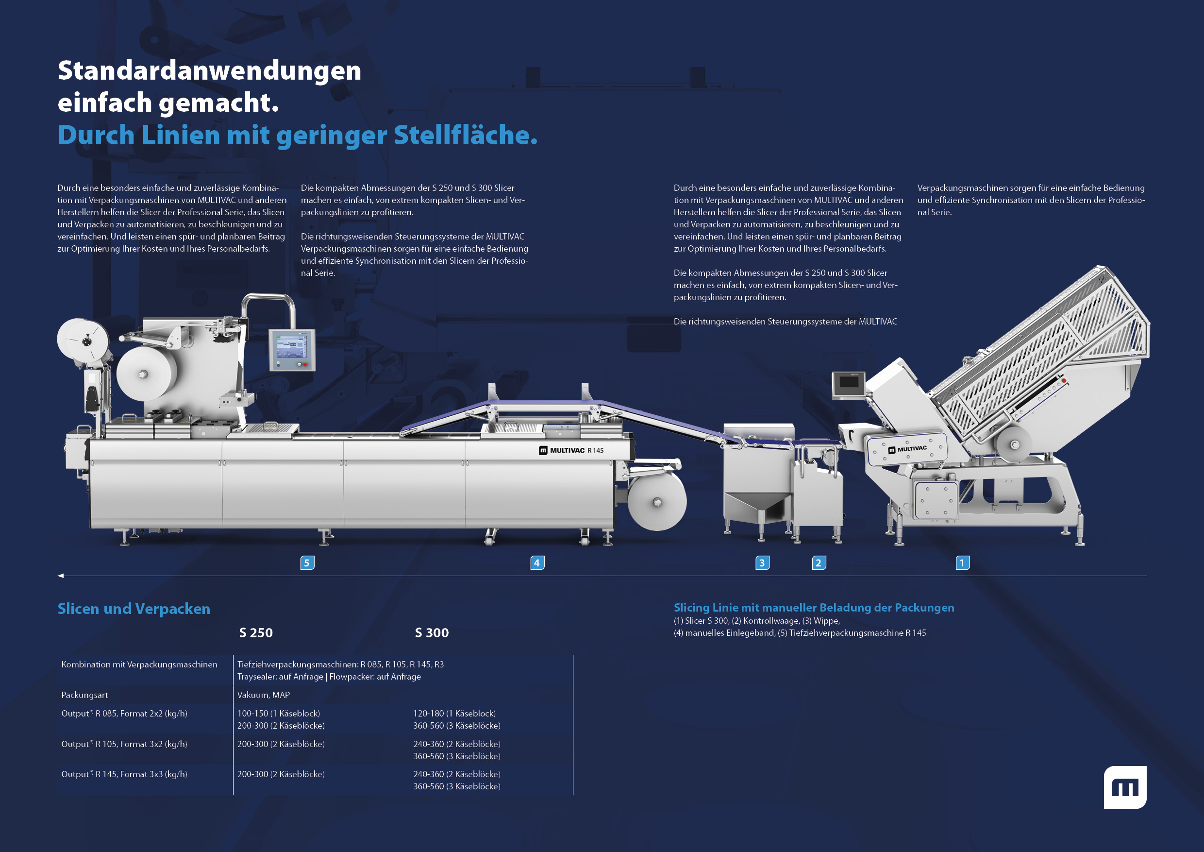
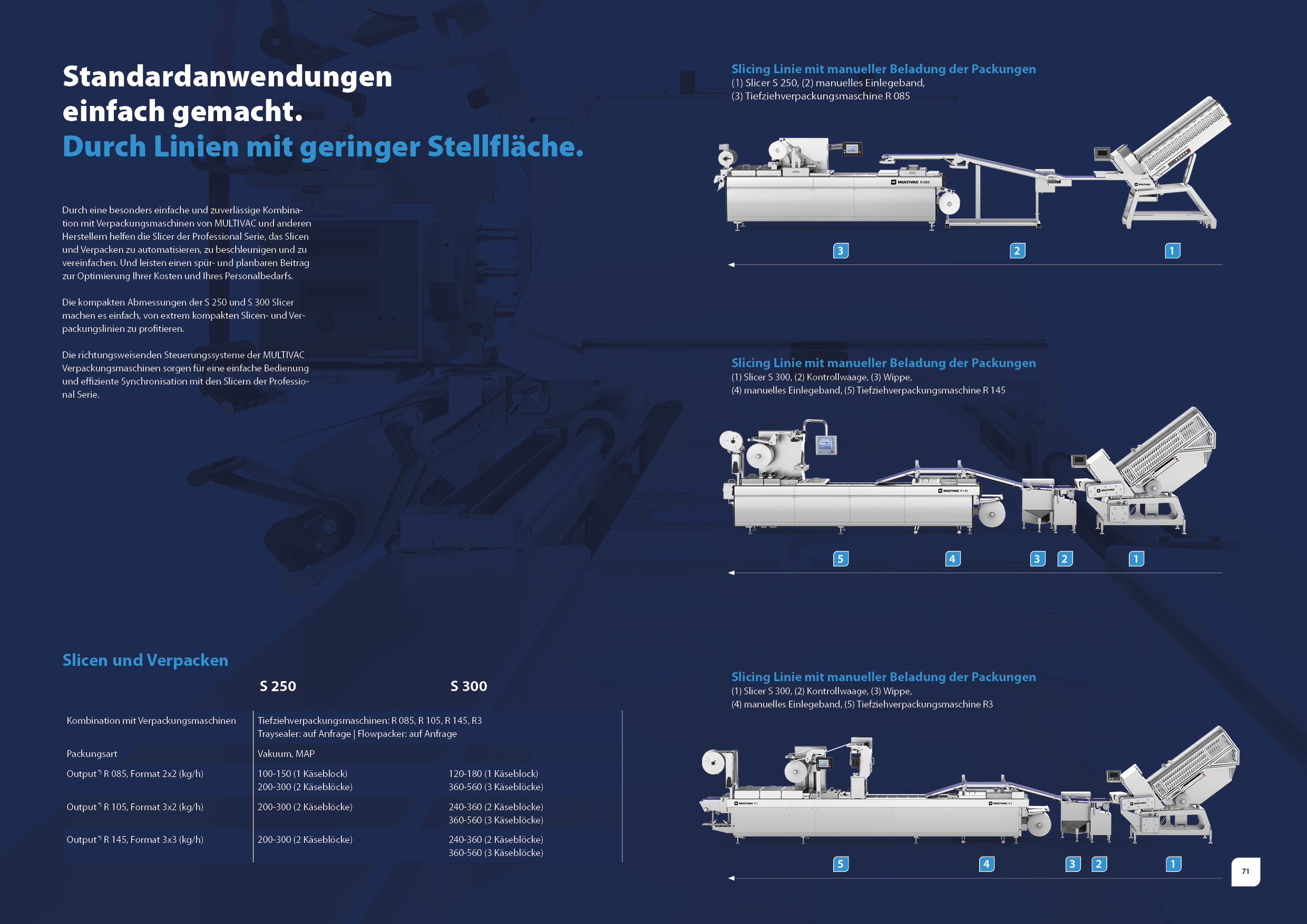
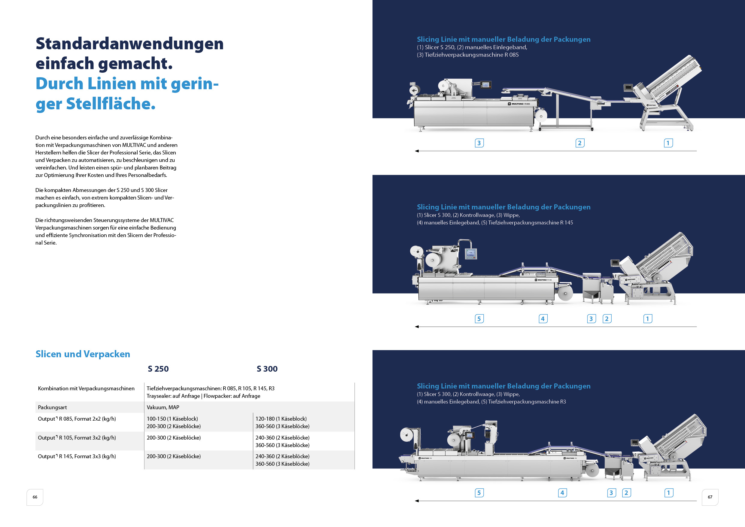
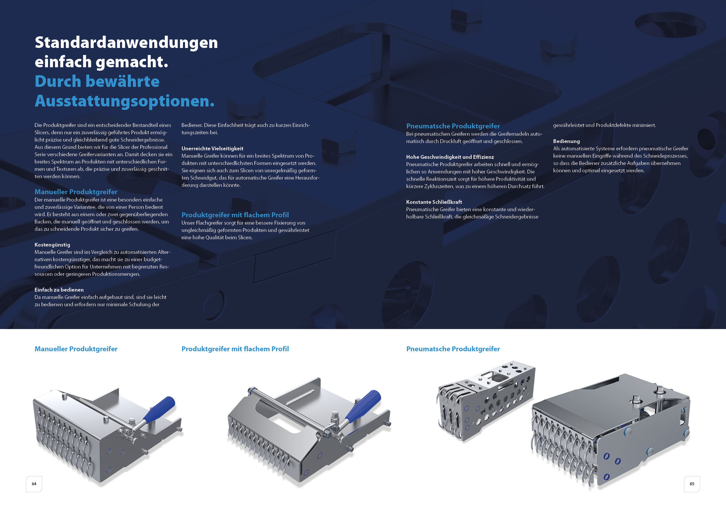
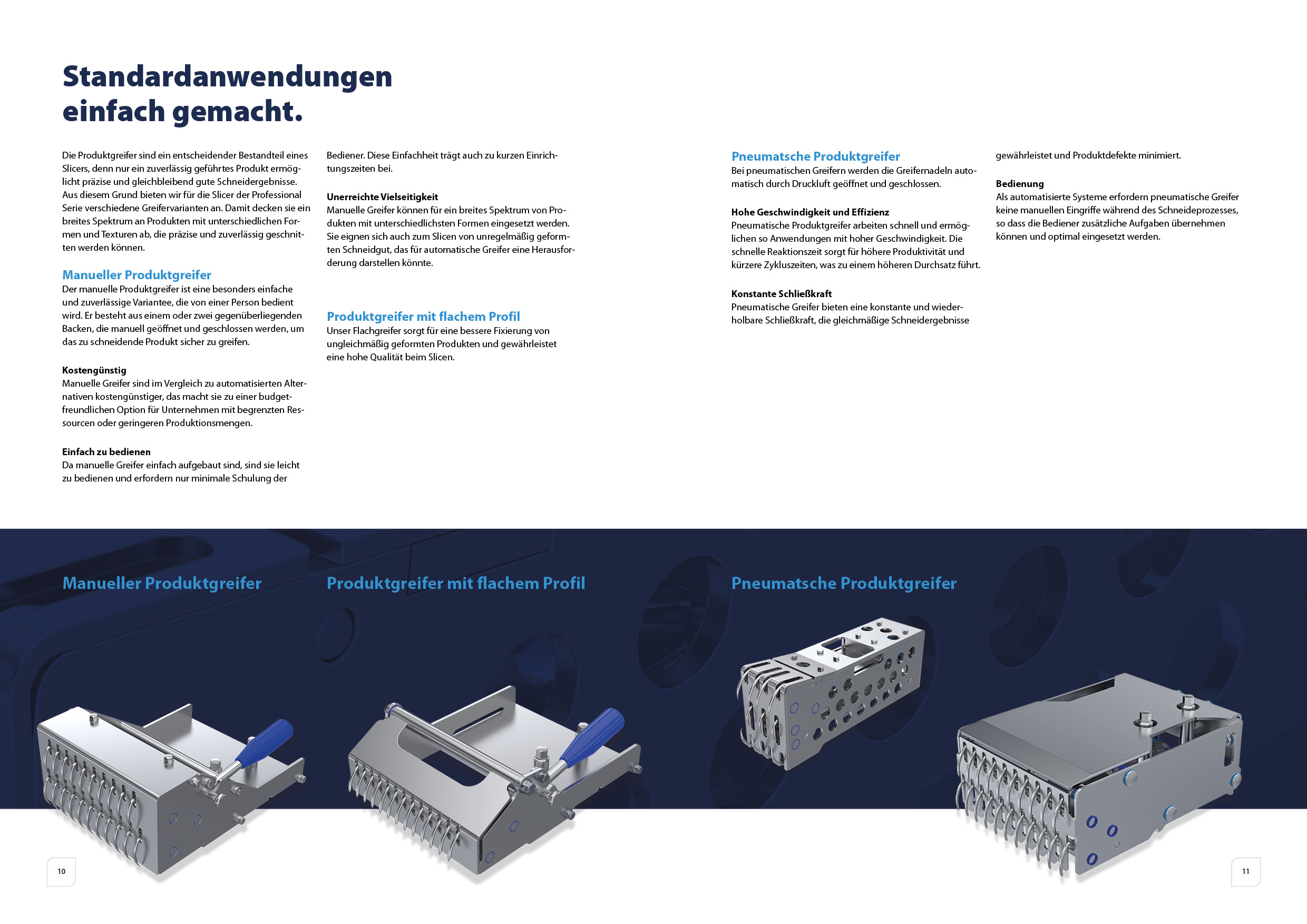
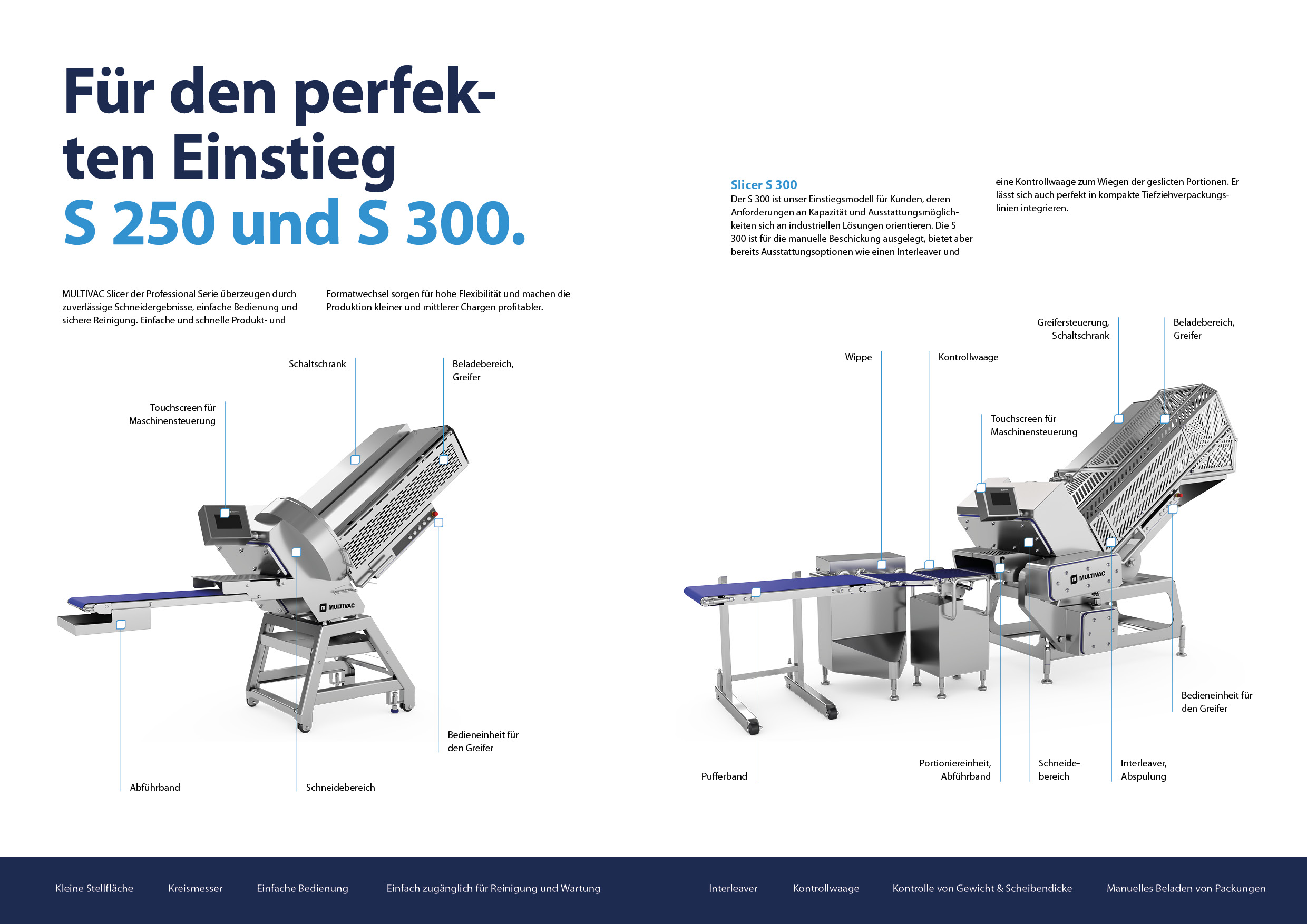
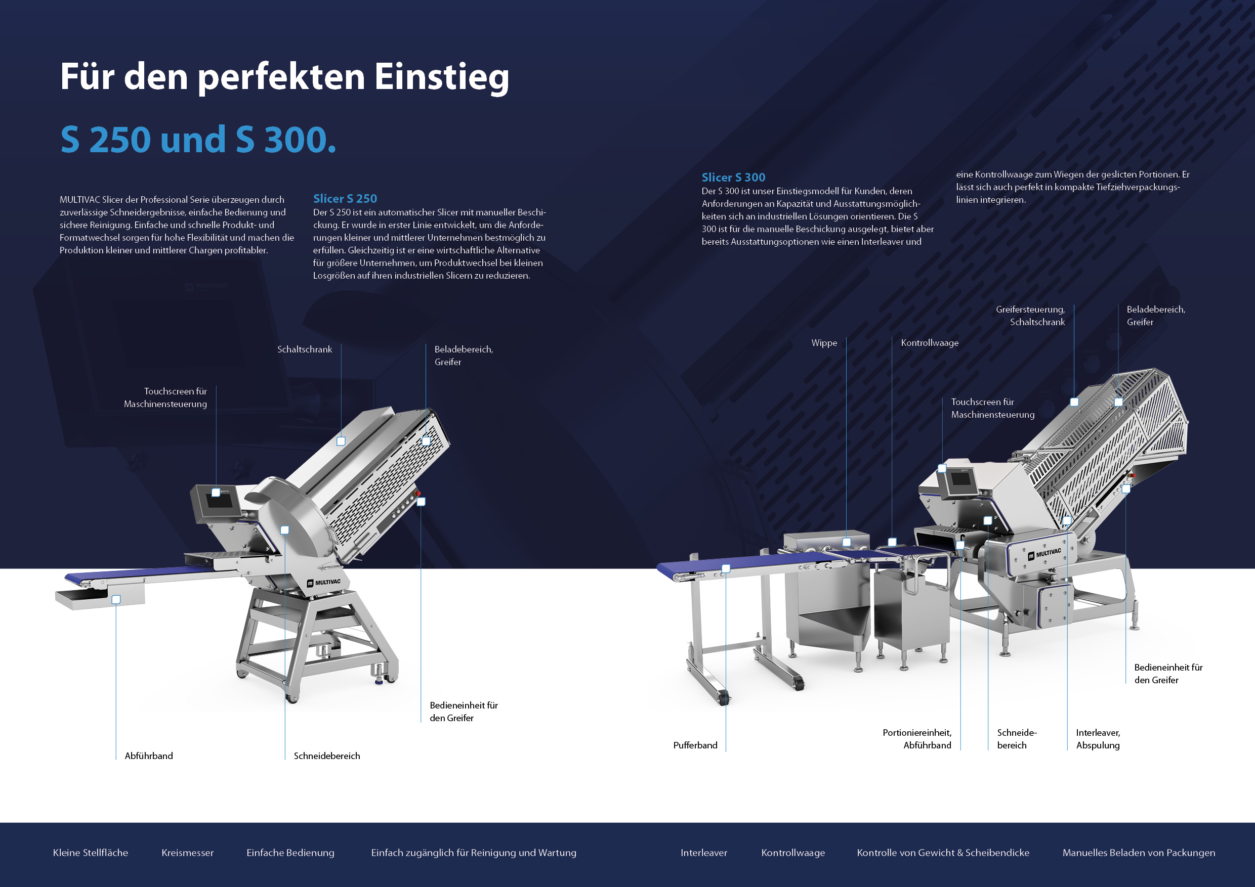
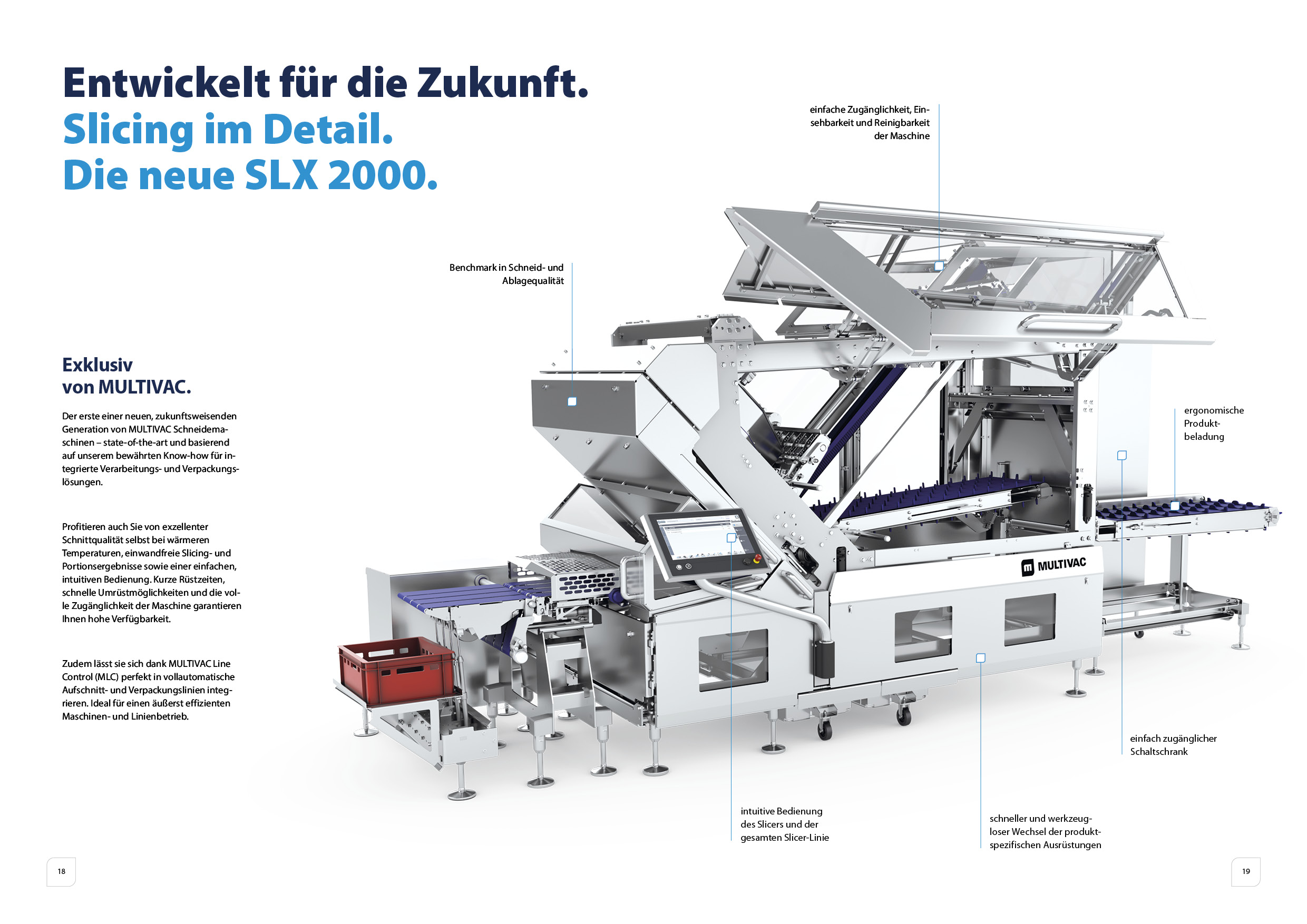
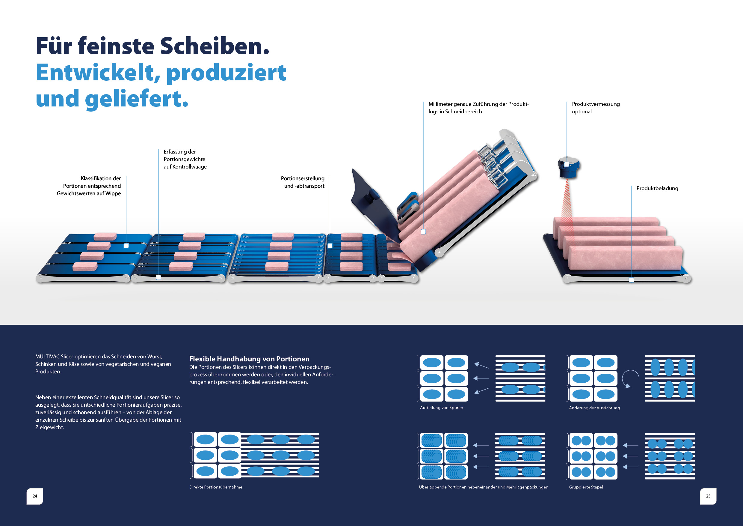
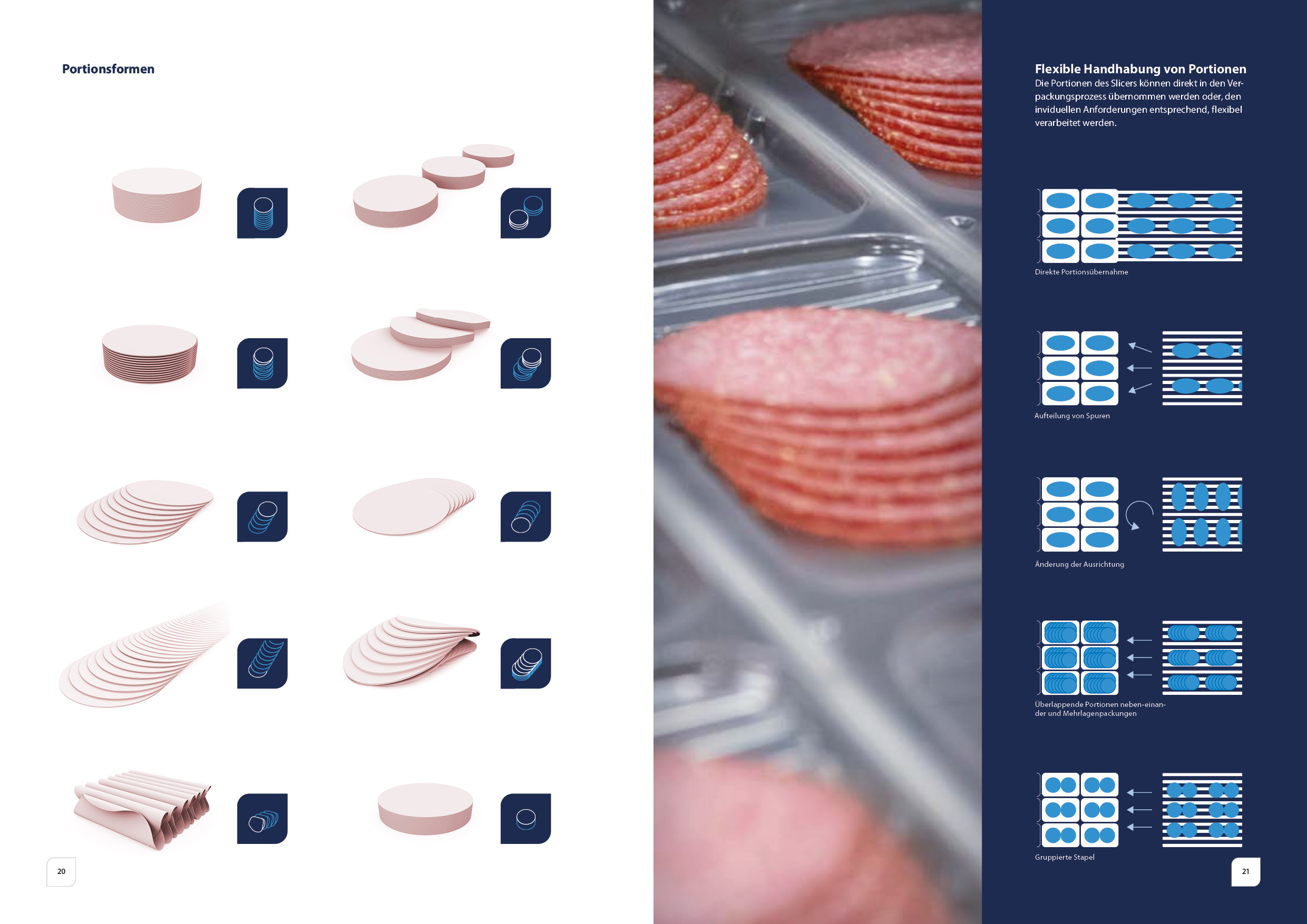
On this page, the solution, for example in the form of packaging or a machine, is presented in detail. The machine takes centre stage and is presented in a specially created virtual space. As already shown above, different variants of the product detail page are also available here, which are characterised by a different colour weighting. In one variant, the background is blue, creating a blue wall in front of the machine. With a blue background, a thematically matching image from the corresponding area is used and multiplied into the background. Depending on requirements, the machine can be displayed with or without hedgehogs and with numbering. If the machine takes up a smaller part of the page and functions more as an accessory, it can also be placed on a white background with a shadow.
Back
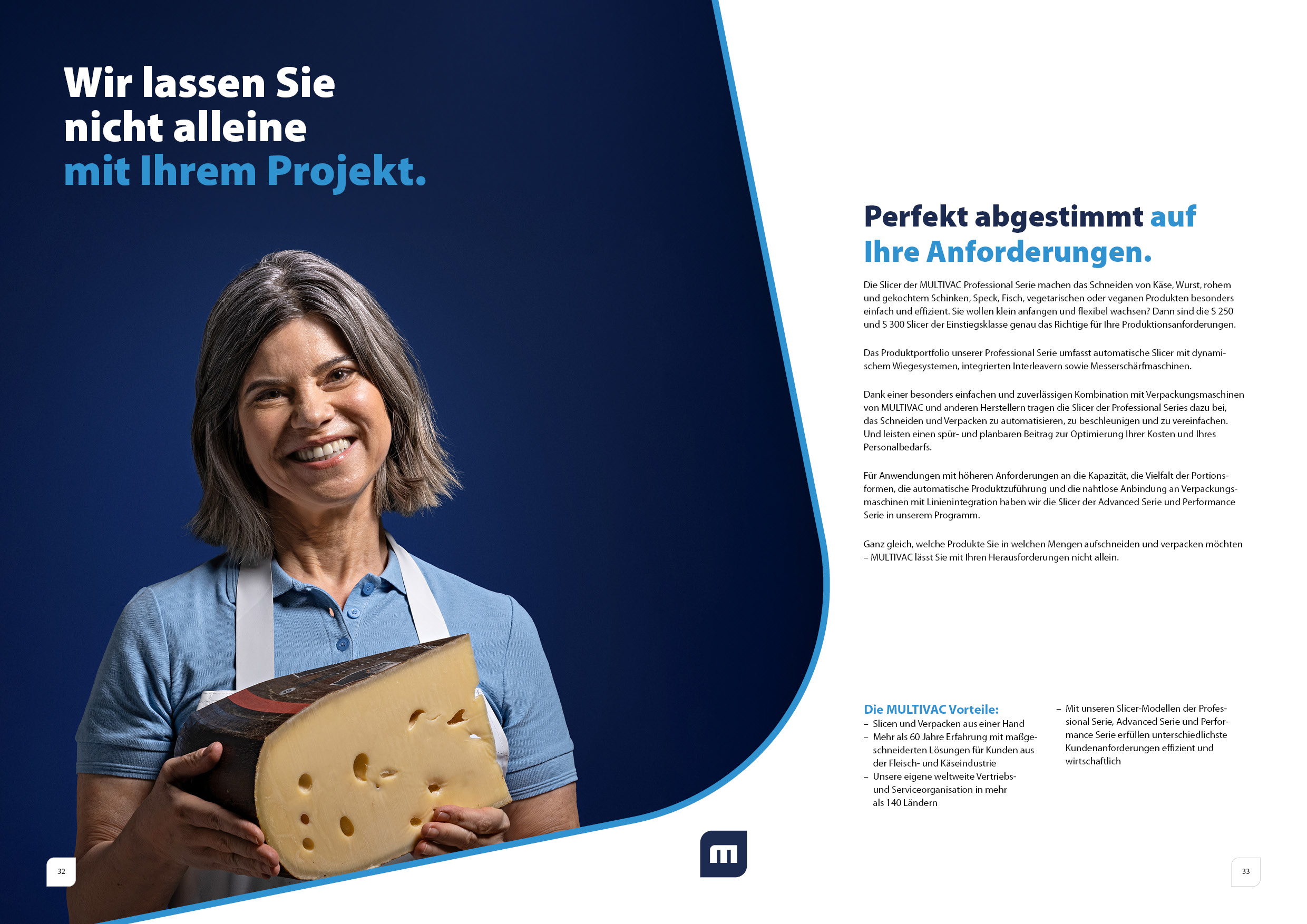
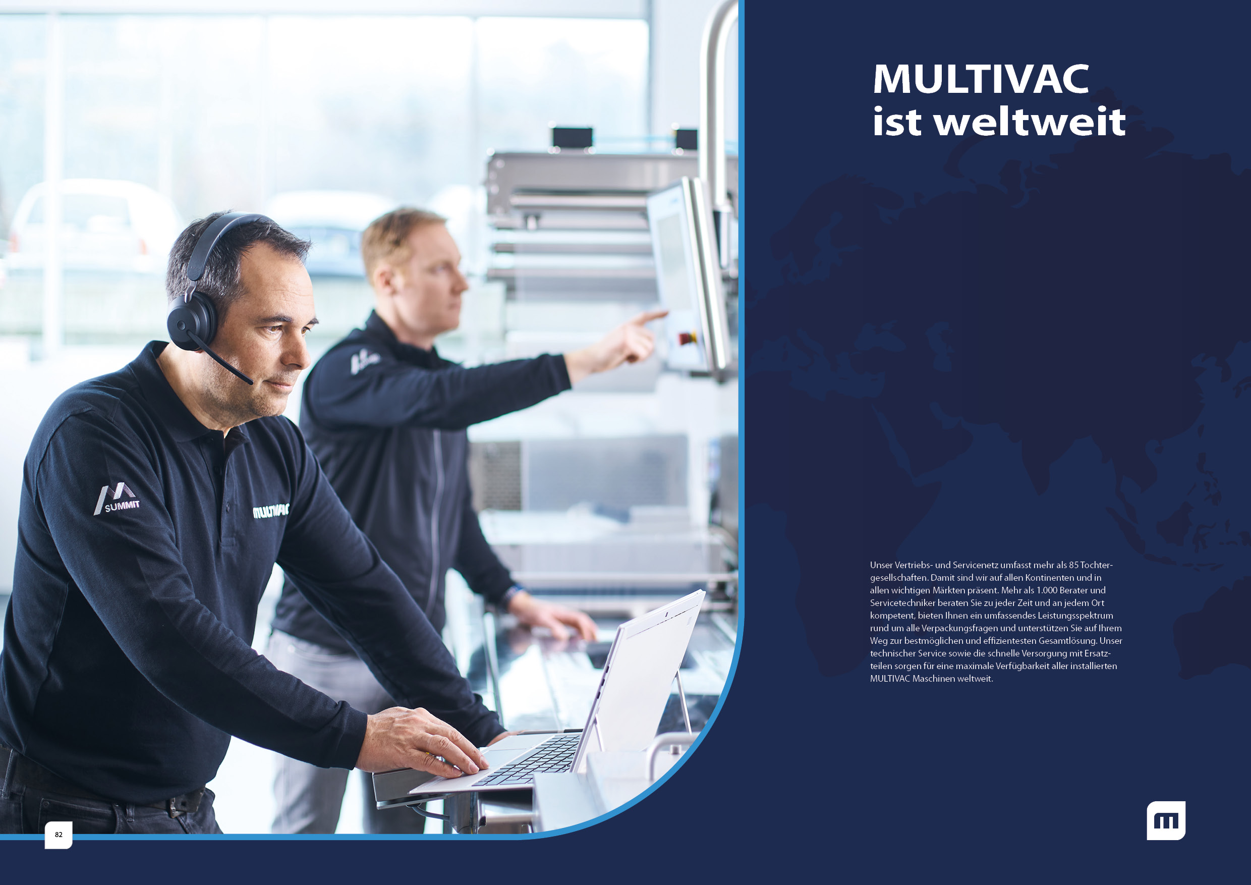
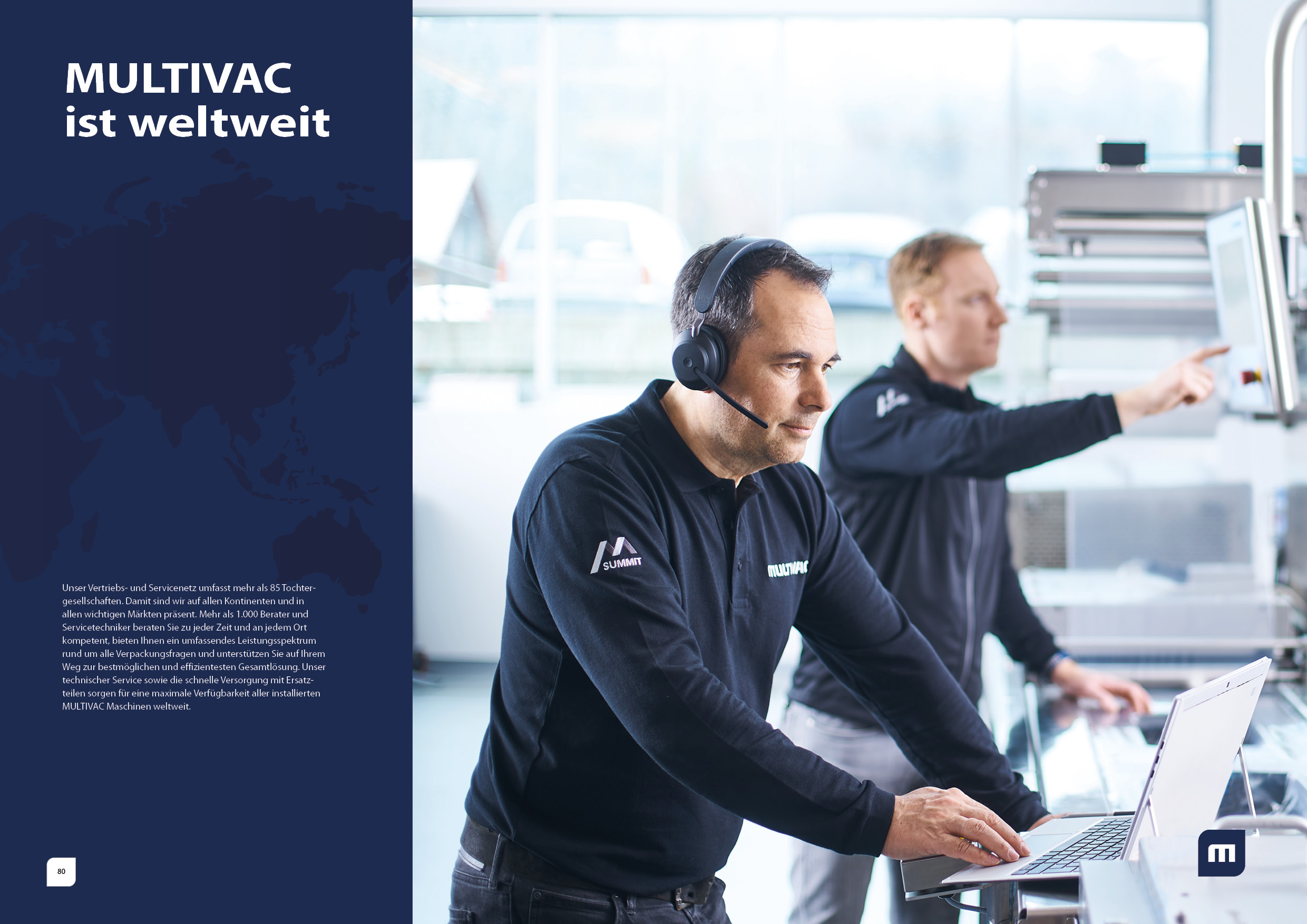
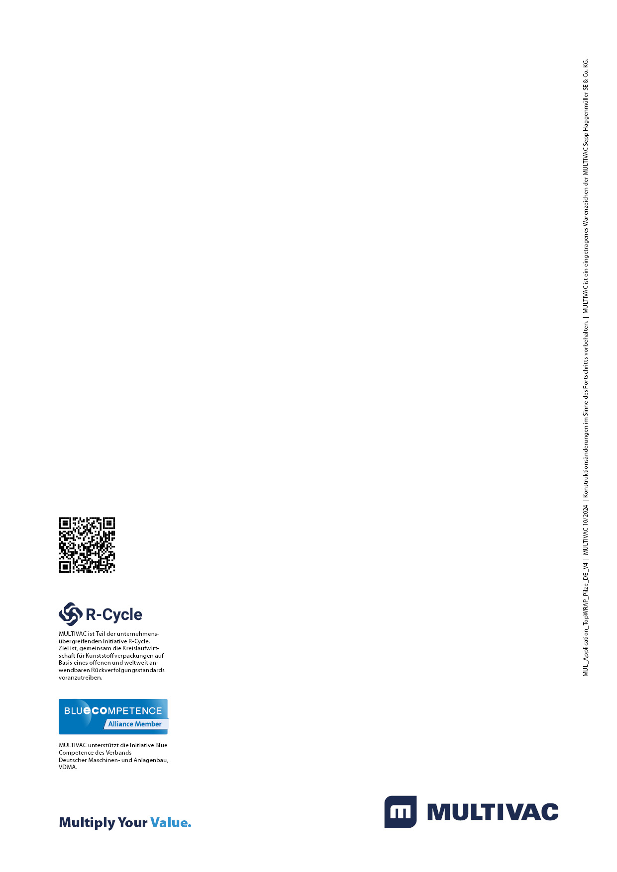
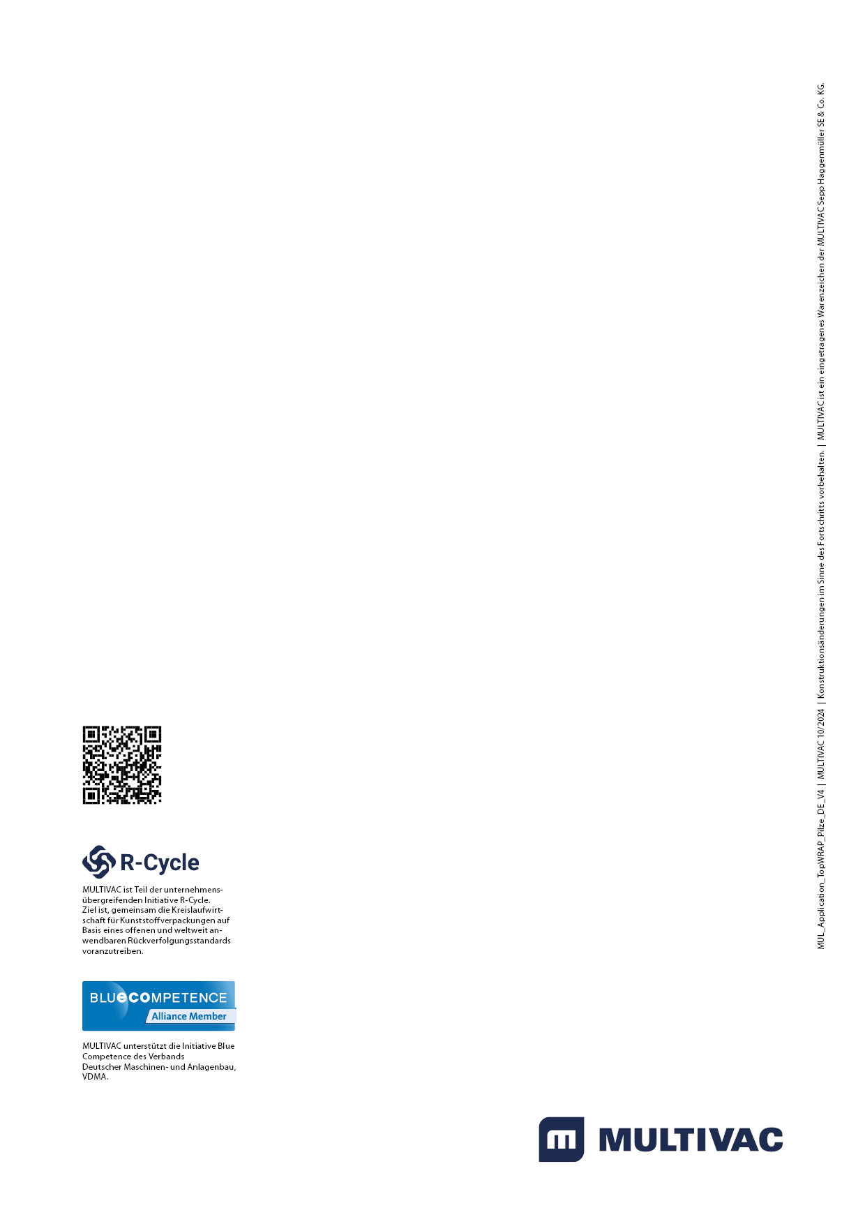
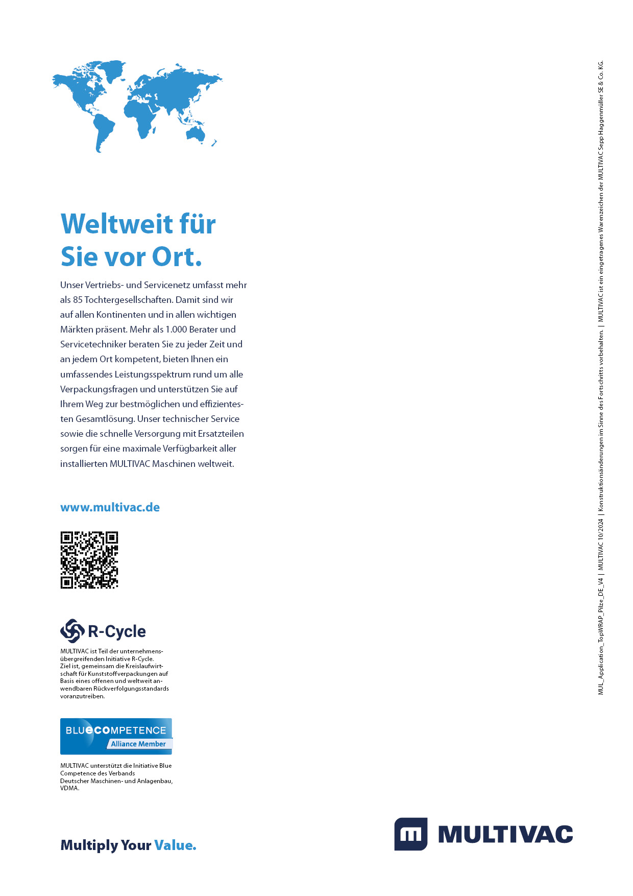
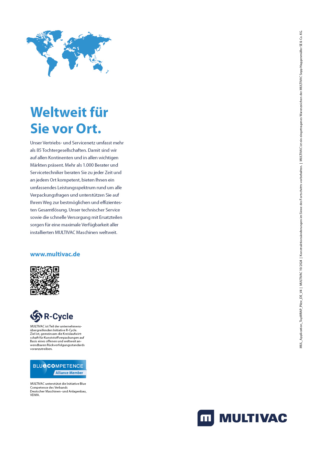
The design of the back pages of our brochures varies depending on the total number of pages and follows the principles below:
Single page or double page:
-
- Single page: If the total number of pages in the brochure is divisible by four, a single page is used.
- Double page: If the total number of pages cannot be divided by four, a double page is used to create a global reference. In this case, the global reference on the single page is omitted.
Placement of the slogan "Multiply your value":
-
-
- The decision as to whether the back page is designed with or without a slogan depends on whether the slogan has already been placed on the front page.
- The reverse side with the slogan is therefore used for product brochures of level 2 and level 3 of the hierarchy
-
For product information, the reverse side including the global reference can be omitted and the logo and path can be placed on the last page described.
Variant A Variant B
Paragraph formats
A consistent set of paragraph formats is used on every page of the brochure to ensure a harmonious and professional appearance. Headings are always in a clearly defined relationship to each other, e.g. a main heading in font size 40 and a subheading in font size 20.
Further details on typography can be found at Basiselement\Schrift\flexible typography.
Link/Path
Formatted document with the different paragraph formats H1, H2, H3 etc...

